Sunday, November 25, 2012

Pumpkin Work

In the last week, I've been concentrating on the pumpkin. It's now showing signs of collapse, but fortunately the colour hasn't changed much. In these lighting conditions, I can see the following on the real thing:

  • cool highlights in the upper left of the pumpkin's face which appear to me as a pale yellow-white.
  • warm reflections in the contained shadows on the bottom part and right side. The base has picked up some of the warm ochres in the wood. The right side is warmed by the deep reds from the adjacent red cloth. And on the top, I can see modest browns reflected from the basket above.  For all of these areas, I mixed cadmium orange with red madder (for warmth) or mars orange (for a muted brown-orange).
  • a band of cool orange-greys just above bottom shadow. These are half-tones that have been cooled with grey. The challenge for me is that they also reveal the texture of the pumpkin, especially its pits, gouges, lines, and pimples in a variety of a oranges, some warm, some cool.
  • variations of a warm and intense cadmium orange on the face of the pumpkin. The area below and above the highlight seems to show the strongest orange. 
This colour pattern of cool, warm, cool and warm is not unlike what you'd see in a human face or figure. My model isn't moving but it is beginning to rot... 


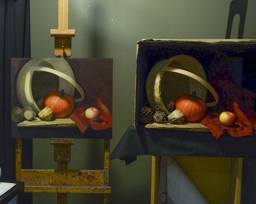
Below is a closeup of this week's work, followed by another photo of the full setup.


These photos unfortunately don't capture the range of colours and values, especially in the shadows...
Nature deserves better.


Friday, November 16, 2012

Butterfly in the Home Studio

Here's a new still life set up that I created at home this summer.  The subject is a blue morpho butterfly that I bought in New York from the American Museum of Natural History. It's the amazing  iridescence and sheen of the wings that appeal to me. I want to see how close to the real thing I can get by using an indirect method of painting.


That's where I will first paint the blues as they appear. Then I'll cover them with a layer of white -- the brighter the blue on the wings, the thicker the layer of white that goes on top. Once the white dries, I'll start glazing over the white again with the original blues, using multiple thin and transluscent layers. This should make the blues glow brighter than if I simply mixed blue and white directly. I'm going to try out a few other subtle tricks to help give the illusion of light and a sheeny, slick surface.

In front of the butterfly are three other elements: a pile of powder blue pigment (a souvenir from Rome), a small jar which will be filled partly with linseed oil, and a fan brush dipped in the power and oil. It's the powdered pigment and the oil that are combined to make the paint that we squeeze out in tubes. This manufactured blue itself will never match the magnificence of the butterfly's wing's and perhaps that's the theme to the piece.


My point of observation is about 7 feet from the stand and from the easel. In that spot, I'm facing neither the stand nor the easel directly, and for that reason the cutting board is not perfectly horizontal. In fact, it appears to rise up on one side. I did this deliberately to create more dynamic shadows and angles, to mimic the angles found in the wings.

Below is the quick "dead colour" state of the painting so far whereby paint and mineral spirits combined provide the first thin, "matte" or flat layer of paint.  I'll start on the wings properly next.


Thursday, November 15, 2012

A New Still Life -- and the perils of perishables

The challenge in this new painting is to paint organic objects before they perish. For this exercise--the last required still life in the Academy of Realist Art's program--students normally choose something that is common, available year-round and easily replaceable like a cherry tomato, a lemon, or a wedge of garlic. More daring students have chosen fresh flowers and fish from the St. Lawrence Market and then painted them rapidly in one sitting. (With fish, you can understand why).

I wanted to use some autumn vegetables, especially ones with unusual colours and shapes like the gourds that start appearing in the supermarkets markets in September.

The composition I ended up with consists of one pumpkin, a yellow gourd, and an apple, placed near an overturned basket with pine cones scattered about. The more I stare at the setup, the more it seems to me like the vegetables are assuming personalities. Here the apple is on trial. The pumpkin is the judge. The gourd is the prosecutor. And the pinecones are security guards.

My biggest concern was that the pumpkin would spoil before I had a chance to finish it. I started painting it first. As insurance, I have 2 substitutes in our fridge at home, waiting to stand in when needed. But it turns out that the gourd was the first to spoil, with a green mould appearing practically overnight a few weeks after setting up thie scene... The apple is doing just fine and I'm not worried about replacing it.

Below: the painting and the setup as of November 14th.


Here's a close up: 


This is the best reference photo I have of the gourd in its current position. I painted it fully this week and just need to add highlights later. 


In an earlier vision of this painting, I used a larger green apple, but it was too distracting.


My first gourds were elongated and more colourful but the setup didn't work.
 

Sunday, November 4, 2012

Figure Painting of Chol -- Finished, Framed but not yet Varnished

Over the summer of 2012, I reworked my figure painting of Chol.

In our original setting over the winter, Chol was posing on our piano bench in front of a black screen, with a single light source on his left and our gas fireplace on his right.

I decided to give the background more atmosphere by brightening one side and suggesting planks on the floor receding into the distance in the direction of the sitter. I made the figure warmer and the background cooler.

Below are two views of the painting on my easel finished but not varnished.


And here is the picture framed and hung under the track lights in our hallway.  It has a temporary varnish on it called Retouching Varnish. I will be giving it the final, proper varnish next summer once it is completely dry.


A return to blogging with a finished Thomas More portrait

My last post was in March 2012. It's time to update my painting adventures in the last seven months.

I'll begin with my copy of Holbein's Thomas More. I finally called it quits on September 3. My idea to lighten his mood by putting a role of Lifesavers in his hands does not go over as well with the peanut gallery as I hoped, so he remains true to his 1527 incarnation. The dark colours have begin to sink in so I'm looking forward to Varnishing Day in summer 2013.

The first two images below were taken on Labour Day on the deck at the cottage.


For this painting, I decided to have a custom handcrafted frame made from a company in Chicago -- Husar Picture Frames (www.husarpictureframe.com). I sent them several photos and measurements and together we choose the perfect frame from their extensive catalog of corner frames and finishes. 

Below is a picture of the painting sitting on our mantel, unframed. 


And here is the painting hung with its new frame. Once it is varnished next summer, it will be truly finished.


Saturday, March 3, 2012

Figure Painting of Chol -- March 3 update

By the end of today's session, everything looked quite fresh, which has made photographing the painting rather difficult -- so many reflections. Below is my best shot.  Before we began, I "oiled in" the panel,  applying a thin layer of linseed oil to bring some of the areas I've worked on in previous weeks back to life. As darker colours dry, they tend to fade and turn grey and it's hard to tell how dark something really is without oiling it back in. Today's focus was on the head, chest, and stomach areas.  Even though it's hard to tell in this photo, the dark areas of the figure (head, rib cage, and right calf) are now more in sync in terms of value. The hands and feet still need more modelling--they're quite rough.


Sunday, February 19, 2012

Figure Painting of Chol -- updated

This painting is evolving each week, as it should. Previously, I added a running shoe on the bottom right side to add a bit more balance to the composition. To keep the viewer's eye in the painting, I decided to point the shoe towards Chol's right foot, rather the outwards towards the painting's edge.  Colour continues to be a bit of a struggle. In the setup, much of what I see is a cool grey, with only shades of warmth appearing to me in the deepest shadows, especially on the left side, closest to a gas fireplace I keep going.  This week, I brightened up the background in the top left, which seems to help the figure pop forward more. I also concentrated on modelling the hands and feet for the first time and when those areas are dry next week, I'll continue until they're done.


From Saturday Feb 18:


From the previous week,  Feb 11:

Cold-Warm Figure Painting -- Updated


The image below is from my sixth session Feb 15th.  In this exercise, the skin tones are primarily warm (Venetian Red + Flake White) with grey added in areas to cool them down. I just finished the stomach/chest area last Wednesday, which followed the previous week's attempt to get the temperature of the legs right. The legs are relatively "cooler" than the stomach because they're picking up reflections of the (cool green) platform the model is sitting on.  The shadow area in the chest/stomach is more isolated (or in other words less influenced by the environment)  and so it has the warmest, most intense red.  I still have to model the feet and hands but in general I'm moving up, focussing on the warm vs. cool relationships. 


Sunday, January 29, 2012

A different Figure Painting

At home, I have another figure painting underway.  Our friend Chol is posing for me on Saturday mornings in our living room in front of a black backdrop. Below is my progress after the 3rd session yesterday.  There are still some drawing issues to correct, but overall I'm pleased at how it's going.  The basic palette I'm working with is ivory black, flake white, burnt umber, burnt sienna and raw sienna.  I'll be adding some green to the white for highlights, but I still have to figure out the best mix for his skin in the shadows. The classic pattern of cool highlights, warm skin tone, cool half-tones, and warm shadows doesn't seem to apply to the same degree here.  In this last session I was concentrating more on getting the values right than the colour.


Setting the Palette for Skin Colours

Pinned to a wall in the figure painting room at the school is Juan's palette for flesh tones. The principal colours he uses are: Lamp Black, Veridian (Green), Burnt Umber, Burnt Sienna, Cadmium Red, Yellow Ochre Pale, and White (Lead or Titanium).  Optional Colours include: Raw Umber, Ultramarine Blue, Cadmium Yellow, and Alizarin Crimson Permanent.


Here's a link to an online note summarizing basic rules about skin tones:
http://studioproducts.com/demo/palettxt.html

Second Figure Painting Begins...

I'm on a slow journey to working with full colour when painting figures.

Last fall at the Academy of Realist Art, I started figure painting sessions once a week and the first exercise for me was to paint the model Robin in monochrome -- neutral greys created by mixing ivory black, raw umber, and crementz white.  The image below is the results after about 8 sessions in total. Unfortunately, I didn't have time to advance to the "second painting" stage and smooth out some of the raw areas and edges.


Now I'm on my second figure painting there. This time, raw umber has been replaced by Venetian Red. The objective is to gradually introduce the concept of warms and cools in the painting. The skin tones will be primarily warm (Venetian Red + White), with some cooling down with grey in some shadows.  The background areas will be primarily cool (Ivory Black + White) with some Venetian Red for some overall harmony.   The model is sitting in a dark red velvet chair which itself has been cooled down with greys so that it won't compete with the level of chroma in the figure. (There's a more intense red in the shadow on the stomach than in the chair itself, so that's why the chair has to be cooled down). The image below is from my third session Jan 25th.