Monday, December 7, 2009

Still Life Underway

It has taken a while to get going... The first obstacle was choosing and finding an appropriate "canvas" to paint on. Store-bought primed and stretched canvas, while cheap, proved to be disappointing (made in China). I stretched my own canvas and primed it 3 more times, and the result was much better... But then I was persuaded to try painting on the best possible linen, primed with lead white (which won't flake or yellow)and mounted on archival-quality panels.

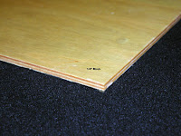
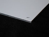
I bought and imported 2 ready-made boards from the States (New Traditions Panels), shown below. The first is baltic birch, sealed on the back with a triple coat of Polyurethane to keep the moisture out and minimize warping. The second is Dibond, a sturdy archival aluminum composite material made of two lightweight sheets with a thermal plastic core. Conservators recommend this panel because it's not supposed to warp.

The second obstacle was getting the canopy installed above the objects to create the shadows I want. Once that was done, I was able to finish the cartoon. Although I could have drawn directly on the panel with paint, I wasn't entirely certain how I would end up positioning the drawing. And so a paper cartoon gave me a chance to make changes without consequences. In the end, I made the drawing vertical and chose new dimensions: 12" wide by 16" tall.

In the photo below, the red squares represent the "Frame". After I snapped the picture, I noticed that tape holding up the red cloth behind the tea pot had fallen off, so the cloth is flatter than it should be...
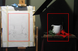


As an experiment, I tried a different approach to transferring the cartoon to the panel. I first coated the paper with raw umber. The oil in the paint was soon absorbed, leaving only the pigment. I then positioned the cartoon over the panel and retraced the drawing with a knitting needle. The end result is below. It's cleaner than if I had used charcoal (the usual approach).

Varnishing Demo

November 23rd: I finally witnessed a demonstration of varnishing, given by Juan Martinez at the school.

The painting had been left to dry for over a year, although only 6 months is needed. Any earlier than that and there's a risk that the varnish will bond with the uppermost paint layers. And the lowest layers may not have settled yet.

Juan washed his painting gently with a damp cloth on a flat surface. Then he opened up a box of Gamblin's Gambar varnish and mixed the 2 components -- resin chemicals dissolved with solvent. GAMBLIN's is the best brand becase it does not yellow over time and remains easy to remove with mild solvents for cleaning in the future (so that the paint layers won't be harmed). Adding it as the top layer of a painting saturates the colors and intensifies the transparency of glazes.

Wearing rubber gloves, Juan mixed only what he needed and poured it into a flat pan. The varnish can't be stored for long once mixed. If it's kept longer than 6 weeks, the varnish loses its UV protection and other qualities.

Re: application.... Instead of a brush, he picked up a sponge edger (for house painting), dipped it in a pan of varnish, wiped off the excess, and then applied a single thin coat to the entire painting.


It looks like a coat of water. But the mineral spirits soon dissolve, leaving a glossy finish. After drying for 24 hours, the painting can be given a second coat to make it glossier. Only 2 layers are necessary.

I found an online demo from Gamblin here.

Old Iris Painting, new thoughts on composition

In 1986, I made this watercolour of a blue iris called "Victoria Falls". I wish I'd known more about composition at the time.

Here are some first principles I could have applied then (source: Michael John Angel's Pictoral Composition article on www.artrenewal.org)
-- a figurative element (even a flower) looks better when placed slightly-off centre
-- all things equal, the eye will go to the centre, or to that area of greatest contrast closest to the centre
-- the eye has a tendency to rise: when two elements are placed one above the other, the eye will eventually rise to the upper one.
-- elements need to be arranged in a comprehensible order, with a dominant element and secondary/tertiary elements ancillary to it.
-- there needs to be unity and variety. Unity (sameness) gives character; Variety (contrast) gives vivacity and life.
-- an anomaly (like a stray branch or flower) can call out to the viewer for attention, but if it's not the main focus, then it needs to be balanced with more anomalies placed around the dominant element. When the repetitions of the anomaly balance the dominant element(s), counterpoint results.
-- pure symmetry becomes boring in a small painting. Elements can be arranged asymmetrically, but balance is important -- lack of equilibrium makes us uncomfortable.
-- Asymmetrical symmetry is the most interesting form of arrangement whereby, for example, you can have a dominant element sitting on the vertical centre line and flanked by the same number of elements on each side, only arranged differently for variation (think of each side of a maple leaf).


So what would I do differently now? Make the central flower larger. Shrink the lower flowers and make them different sizes, placed at different heights, and use the bud as the equilizer (the balancer on a see-saw).

Thursday, October 15, 2009

Still Life -- final arrangement, but without lighting

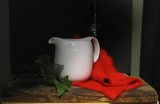
This hasn't been easy but I've settled on a design for the first still life.

I was required to find 3 white, red, and green objects. In this exercise, there are only 2 objectives: to learn how to paint a shiny surface with colour reflections (in this case a white teapot) and to learn the indirect method of painting (the bright red napkin). The napkin is almost the colour of pure cadmium red and cadmium orange combined. Apparently, there's no way to create a full range of lights/darks in a cadmium red object without using a different technique. The normal technique would be to mix white and red together first to create a lighter value, but this only produces "pink". So the indirect technique is to paint something white FIRST and then apply glazes of cadmium red on top until the correct value is achieved...

The green is purely incidental. I was going to choose a set of plastic green grapes but was advised that they'd end up looking plastic. So then I experimented with a plastic leaves and settled on this branch of ivy. The green wine bottle in the background will be in shadow and I may pull it out entirely.

The board was suggested by an instructor as a means of adding texture that would contrast with the smooth, shiny surface of the pot. I've deliberately dangled the cloth and top leaves over the edge for another perspective.

Here's a view that from about 7 feet away. I still need to set up the canopy above the objects and angle the light differently. The light, while the correct distance, is directed straight on at the moment. I will be putting it on an angle...

Tuesday, October 13, 2009

head and shoulders

Latest update: On Thanksgiving weekend, I concentrated on modelling the head and shoulders, as well as the shirt collar. The left eye is placed marginally too high on the figure (based on source photo) and I haven't given the head the same tilt it had, either. But those are minor details that I can choose to sort out later when I return to the head. The blue shirt also needs to be darkened considerably, right to left; and the lightest light of that shirt is currently too bright. The side of the shirt leaning against the curtain also needs a darker grey shadow, which is cast down and across from the window frame. But I will only be able to work these subtlies out once the entire background is in... That's the next task. The painting is now safely at home from the cottage...

Sunday, October 4, 2009

Blue shirt and shorts...

I spent some time this past Saturday trying to catch up on other areas... The previous weekend, I worked on the hands, arms and book. Here, I tried to bring the right side of the shirt and shorts up to par, by darkening them to match the value of the arm. Same with the background surrounding the head and torso... Head, and left side need to follow suite. Ideally, once everything in the figure is at the same stage, and it feels like it's one piece, with the light moving from the left to right into darkness, then I'll be read to tackle the background.

I've started to sketch in the window pane on the front left, making the frame narrower than it actually is... And I realized too that the back end of the cottage needs to be very soft and considerably darker than I've left it. The perspective on the back window pane makes it quite grey and hazy...

 
Posted by Picasa

Tuesday, September 29, 2009

Update on Wayne's Portrait

In the last two sessions, I've worked on modelling the legs, arms and hands, so now there is at least some paint everywhere over the figure. But now the clothing, head, chest and background need to catch up in order for the overall lighting on the figure to make sense. Wayne's left arm, for example, is the correct value (if not the right colour), and now the surrounding shirt and shorts need to darken on the right side considerably with a mixture of ultramarine, black, and some burnt umber... Once I get the values everywhere in sync, I'll take the picture in to the school for a critique before going further.

Finished...

It's finally done, just over a year after stretching the linen and starting the first drawing. It's home now, drying for the next six months until I can varnish and frame it. In the meantime, at the school, I get to move out of my space in the workshop room shop and into a permanent spot to start the first "still life" in red, white, and green.

Tuesday, September 1, 2009

Time to put away the big brushes...

I repainted the entire background last night (adding a bit more yellow to the mix) and also the cast shadow to the right of the base. I always find the shadows hard to paint. The nearly solid, dark interior (umbra) is easy but as I move out towards the edges towards the light (the penumbra -- almost a shadow, where some of the light is obscured), there's quite variation of subtle patterns... In some places you see a feathered effect, in others definite lines but no hard edges, and then there are blobs where the shadow is equally transparent, as if generated by Photoshop...


Now onto the smallest brushes for some finishing touches in the interior, softening some edges and pushing up some dark shadoes in the centre of the head to punch out the sides of the face and head (the parts closest to us).

Two more sessions max, and then I'm calling it quits on this one...

Sunday, August 16, 2009

Early start on Wayne M. Portrait

I've started laying down some "local" colour in the figure and background, but know I have a long way to go. I'm not sure yet how I'll deal with the bulky window frame or the furniture behind the figure, so I'm setting them aside for now. My goal is to colour in the clothing and body, getting the correct values in the lights and shadows, and the immediate background of the curtain. In fact, I'll know when I'm ready to move on when I have 4 distinct values: the background, the cast shadows inside the figure and on the floor, the contained shadows in the figure (like the neck area) and the areas in direct light... I know appreciate why some old masters worked first in grisaille (monochrome) before adding colour...


Michelangelo Copy: Detail from 1542 Battle of Cascina

Once upon a time, Michelangelo received a commission to paint a fresco of the Battle of Cascina between Florence and Pisa. He chose an obscure, peculiar episode of
Florentine soldiers bathing in the Arno river. A captain sounds the alarm (false as it turns out) of the approaching enemy and Michelangelo depicts them scrambling to get out of the water, dressed and armed... The fresco, intended to serve as a clarion call for preparedness, was never done. Some studies of his composition survived, including a painted grisaille copy of the cartoon from his assistant Aristotile da Sangallo, 1542.

I've chosen to do a detail, highlighted by the red box below. The actual composition is about three times what's shown below.


Two years ago, long before I was aware of this source (in a book of complete drawings by M.) I saw this copy below on a friend's wall and photographed it, intending to make a copy.


Now that I have an "original" and this copy side by side, I can see major flaws in both. The hand gripping the pole in M.'s original is grotesquely out of proportion, as are most of the muscle groups... But in the unknown copy, the modelling of the forms is terrible (like rough plaster); the bundle of clothing held in the left hand of the central figure looks like a loaf of bread!

I hope to do better. I made a drawing that uses both compositions and transferred it to "Roma Michelangelo" paper (Grey) and also to Canson blue paper. I'm trying a combination of black charcoal and white chalk/pastel for the first time. The grey paper is supposed to serve as the neutral value. I started out on the outstretched arm, just to see what the white, grey, black combination would produce. Zoom in on the image to see it better...

Thursday, July 30, 2009

Preliminary Drawing for Wayne M. Portrait

(Posted from the cottage)

I made a quick drawing based on the photograph of Wayne at the cottage and transferred it to the canvas by colouring the back of the drawing with charcoal and then tracing over the drawing. I didn't have enough vine charcoal with me so I used compressed charcoal, which is very dark. More of it transferred onto the canvas than I wanted. I could wipe it off or wash it over, so I ended up applying a thin layer of Titanium White over the charcoal, leaving only the outline. Two days later, that thin layer hasn't yet dried, which makes me wonder if there's something in the charcoal that is causing the delay... (and yet Ivory Black, which I use as my black paint, is basically charcoal). Guess I'm impatient. I've sketched in some of the lines for the windows, wall and floor shadows, but will need to fix a vanishing point off to the right beyond the canvas to get the perspective lines accurate. The canvas turned out to be smaller than the 30" by 24" size it was supposed to be so my "centre" point changed slightly.

Below is the initial drawing with the figure at 60 cm tall.


Here is the drawing transferred onto canvas:


Now while waiting for the paint to dry, and the rain to stop, I'm getting back to some other unfinishedp projects...

Sunday, July 19, 2009

Harmonic Proportions and Ancient Design Systems

Old masters made use of classical geometry to find the best way to arrange figures and objects within a given space. The composition scheme based on harmonic proportions is the most common one (and it derives from Pythagorus's discovery of harmonic proportions -- musical root harmonies -- that explain order and beauty in sound).

I created two samples below, the first on what's called the "armature of the rectangle" and the second on the "root 2 rectangle system" (a rectangle whose dimensions are based on the ratio of the square root of the number 2)

Example 1: Composition Based on the Rectangle's Armature.
I first created a rectangle based on the proportion of my chosen canvas ("30 x 24"). Then I sketched a series of diagonals from the corners and the middle of the sides. Where they intersect, the natural harmonies are created. I've highlighted these with circles. They represent where the eye of the viewer naturally moves to. The goal is to frame subjects or objects at certain harmonic divisions, to rest or place parts of a figure along a diagonal, or to run a harmonic division through key places in the design (typically an eye of a figure).

How did I do? Pretty well, considering I didn't think of the compositon of the surroundings when taking the reference photo. The dots on the photo below represent the natural "eyes" of my rectangle, situated in the natural centre (half point), thirds, and quarters. On my computer, I arranged the photo under the rectangle's armatures diagonals so that the bottom of the book's spine would meet the absolute centre. The remaining eyes are in unusual places but at least I can see some parts of the figure lining up with the diagonals, and Wayne is centered. (If I had asked Wayne to lower and close the book slightly, it would have been perfectly placed)... The grey strip on the far left represents how far I will have to extend the window in the painting to keep Wayne in the centre.


Example 2: Composition Based on the Root 2 Rectangle.

Here, I've taken a Root 2 Rectangle (height 1.41 x width) and imposed it on the image again. This rectangle is sitting over the larger grey rectangle which represnts my 30z24 canvas. The crossing of the main diagonals with the secondary diagonals creates four 90 degree angles and divides the rectangle into thirds. These crossings become 4 "eyes" (the equivalent of the green eyes in the previous picture).


Again, after centering the figure, I see it's not a perfect fit. BUT now I know how big to make the figure and where to position it on the canvas... With this Root 2 rectangle, my figure would be smaller (59.62 cm tall) than with the Rectangle Armature design (66.98 cm tall) -- my preference is the first.

New Project: Portrait of Wayne M.

Here's a new project I initiated July 11th at the cottage. Wayne kindly posed for me in our living room, looking out over the deck towards the lake. The winning photo, chosen from among fifty or so, is shown below. We decided to go for the full figure and include more space around the figure for light and depth.


I bought a 30" x 24" pre-stretched canvas today, to which I'll add another layer of gesso and sand it down for a smoother surface. Curry's art store did not have linen in the size I wanted and I don't have time to acquire the best linen from the school -- I want to get started on this next week. I considered canvas board and masonite as the surface, but decided against it--better wait for a smaller project to experiment with a new surface.

The next challenge is deciding on the actual size and relative position of the figure on the canvas. Experimental images to follow in the next posting.

The Gaul is nearing the end...

Meanwhile, back at the academy...I've cancelled the summer break that I intended to take in order to get this painting done and move onto my first Red/White/Green still life...

You know it's time to finish when the statue has accumulated so much dust that the values you first painted now need to change. This happened to the top of the cloth upon which the status is resting; it's now so much lighter because of a thickened layer of dust (which wasn't there at the start). I had to lighten up my own copy to match this week while finishing the base. (I raised the painting on my easel so I could reach the bottom easier). There's still some touch up work to do there...


Here's the close up below. Notice the "parallax" effect of my camera; the side of the canvas seems to bend but it's straight of course.


I can now count on one hand the things I need to do to finish up:
-- second paint the stand and all of the background, including the cast shadows in one go.
-- paint the underside of the beard (the part in shadow)
-- paint the eye socket: needs burnt sienna tint
-- second paint the light area of the statue's plate (the bit between the stand and the fur coat collar)
And that's nearly it, until told otherwise, and I'm sure I will be.

Finished Painting of Patroclus

I've taken this painting as far as I want to as of July 11 and have taken it off the easel for good. In six months, after all of the layers dry thoroughly, I'll varnish it to bring back the fresh look of new paint. In the meantime, I'll hunt for an appropriate frame and look into making a limited set of digital reproductions (giclees) for sale.


Wednesday, June 24, 2009

Same camera, different light, different results

Second painting continues on the Patroclus painting and I hope to finish it in the next few weeks. I'm considering the background and foreground done (except for the arrows in the front). Small areas still need to be rendered on the figure, particularly the hand, and the feet. Some edges need to be softened still (half-tones on the thigh and the upper shoulder. Finally, I'll redo the strands of hair...)

Two weeks ago, I took the pictures below at home, at virtually the same time, in different lights.


Thursday, May 21, 2009

Reds and Greens

A few weeks ago, I took the Patroclus painting into the school and picked up a few tips from David Gluck, including:

  • Using Cadmium Red for the red blanket rather than Indian Red (too dull and cool)

  • Building up the contained shadows on the blanket with darker values of Cadmium Red (mixed with Ivory Black). Previous shadows were too muddy and grey.

  • Cooling the brightest areas of the figure with Green Umber and Yellow Ochre to enhance the 3D effect. This led to new concepts for me about using colours to suggest form the same way I've been using values to model forms (lights, shadows, half-tones, bedbug lines, etc).


I have yet to work again on the figure, but over the Victoria Holiday weekend, I managed to finish the first painting of the red blanket and the surrounding area. I forgot my Winsor and Newton Artist oil paints at home but bought some replacements at a local store. These were from the Winsor and Newton "Winton" line of oil paints, which are cheaper than the professional line I'm used to because they contain less pigment and more vehicle (linseed oil)--making them good to apply in large spaces. I used them to finish the first layer of the foreground.


In the original painting, David added an archer's bow and a scattering of arrows around the edge of the blanket. Because my canvas is larger than the original, with more space around the figure, I've decided to add only a limited number of the original arrows. I've marked their place on the right side but have yet to add any detail.

Sunday, April 26, 2009

Working on the top of the Gaul's head

In my last three sessions, I haven't made significant progress in terms of volume. The forms are so small and complicated, and I have to keep standing back 7 feet or so to make sure that the details I'm painting in at this final stage still make sense. Below is a close-up of the hair on top. It's nearly done. On the left side of the head, you can see how rough the paint and the edges are. They will be smoothed out in this second painting phase once I get there later this week.

Good progress until the power cut out

Up north in cottage country this weekend, I managed to complete the "first painting" stage of the left leg. Without the glare from the window, as seen below, it looks right.

(One bad note: The thick oil-based gesso I applied as a ground marred the smoothness of the painting surface and unfortunately that does matter on small forms. The Achilles tendon gets pinched. It's noticeable from 6 feet away. Up close I can see a vertical "trough" left by the gesso brush. When light hits the trough it breaks up the swatch of skin colour I had laid down for that part of the foot. Ironically, the subject "Patroclus" was Achilles' lover and of course Achilles dies of a wound to his heel...)

I started working on the shorter, right leg when a storm hit us and the power was knocked out for the remainder of the weekend. I didn't have time to smooth out my initial paint layers but fortunately the ball of the right foot is quite wrinkled...

Sunday, April 12, 2009

Painting on Easter Weekend

This entry was made from the cottage while working on the Patroclus painting hanging from a chair (spare easel left at home). My good intentions were not realized: I wanted to redraw the feet and hand, restoring the details and proportions that have been lost. Instead I reworked the shoulder and started modelling the back and arm.

Some notes to self:
-- Some charcoal I used to transfer the drawing is still showing through (near left am pit, for example), so I'll need to redo those areas with some calcium carbonate (plaster) mixed into the pigment to mask the charcoal
-- Minor corrections are needed to the shadow on the spine (widen shadow on left shoulder blade).
-- More half tones are needed alongside the shadow on the spine to make the transition from dark to light smoother. Indian Red and Burnt Sienna are proving good for those values.
-- The chroma in the carpet needs to be dulled with grey/green
-- background needs a glaze of burnt sienna to warm it up and darken slightly.
-- hair still needs to be modelled (and it goes further down the left side of the neck than currently shown). Soften the edges into the background.

Saturday, April 4, 2009

Inspiration: Lenny's still life

I was inspired today looking at Lenny's still life in progress (second painting phase). He allowed me to take this photo (and unfortunaely, the glare on the canvas takes away from it). Some things I really liked: first, the composition. The darks are kept as a group at the back. And the lights are together in the front, joined by a triangle made up of the 3 primary colours, blue, red, and yellow. It's hard to tell this from the photo, but the sherry glass really stands out, front and center. He accomplished this by a) using a rich chroma for the sherry (actually coloured water because real wine is TOO dark to be translucent in these conditions) b) casting the shadow of the glass on the page and using soft shapes and fuzzy edges to contrast with the hard shapes of the glass itself. Finally, I admired the fact that none of his lines or shapes ever line up and so your eye travels in a pleasant way. To see what I mean, look at the books (not straight) and their top edges--different heights and on angles. Plus the globe offers circular shapes to contrast with the triangles and rectangles. A feast for the eye. And something for me to keep in mind for the future.

And on it goes, little by little (second painting phase)

I'm still working away at small, detailed areas, most recently in the hair that frames the face. I'm finding it more convenient now to tackle the lights and darks in a form simultaneously, dealing with it in one go (say, a wave in the hair). I tried this faster approach today with the hair shape to the left of the eye. It was no good just dealing with the shadow area in isolation; the form just didn't turn the way I expected it do. So I moved up to the lights as well, which made blending easy.


The close up:

Sunday, March 22, 2009

Second painting phase continues...

The strategy from the start has been to work from the eye shadow outwards. At this point, the forehead, cheek and nose are finished, so I've been concentrating on the beard and the top of the head. (See second photo below -- red circles mark the spots). The edges that are soft or that I have blended with the background tend push the forms back in space. The edges left hard and with a greater contrats between light and shadow tend to jump the forms forward. When standing back 7 feet, I now experience a visual special effect where parts of the beard appear in sharp focus and much closer than the eye... This doesn't come through in the photos, which tend to flatten the image.

Full view:


Close up:

Thursday, March 5, 2009

Second painting underway for the Gaul

The last phase of this painting is now officially underway. After finishing the first painting of the base, I lowered the painting down on the easel to match the level of the statue again (see below).


I'm currently "second painting" the face, with a 2:1 ratio of mineral spirits to linseed oil. The paint on my pallette is thinned with this mixture before being applied to the canvas.

I started with the forehead and went down as far as the brow (I'm leaving the eye untouched until the surrounding areas are done). Some important lessons were relearned:
1. Lay in a couch of middle value first. Look at in on an angle to see where the glaze is reflecting (which tells you where the couch is and isn't).
2. The boarders (where light meet dark) need to be dealt with at this time, otherwise a hard edge will be left.
3. To create a soft edge, there has to be wet paint in the dark area meeting the light area. As you push the wet light paint into the boarder it blends into the dark paint. If the line of the drawing gets lost or distorted, paint out from the dark border into the light area to restore it. The resulting edge should be soft or hazy.

For the forehead, I had to blend into the edge of the background and the top of the brow, both of which had been prepared beforehand. For the nose, there were three edges: the background, the bottom right of the eye shape, and then top of the nostril. The arrows below highlight these spaces.

Sunday, February 15, 2009

First painting of the Gaul 99% done

In the last three sessions, I've been busy finishing the base. I raised the canvas on the easel so that I could work directly on the lower half without bending down. The elipse on the base of the statue has been extremely difficult to get. The ends curve up and the bottom part remains flatter than I expected. I started on the table this past Saturday and realize now that it's wider then it should be and that the right edge is too straight.

Because I stand slightly to the right of the statue, I need to portray two-point perspective. The sides of the stand need to be angled in such a way that they'd meet in a vanishing point off in the distant upper right of the picture... Meanwhile, the front and back edge should be nearly parallel but not perfectly so (because their lines would meet at a vanishing point off somewhere in the distant left.) Finally, I will need to finish the cloth on the front and right side (especially the folds).


Skin Colours and Organizing the Palette

A recent lesson I learned is to organize the palette by colours and values before you begin a session. Below is a sample for skin colours (for the Patroclus painting). I take one colour out of the tube (Burnt Sienna, for example) and create a range of values down to 9 (white). Then I line up additional colours and do the same thing, trying to create rows of matching values. My first attempt is shown below.


When you begin painting, you first pick the value you need and then determine the most suitable colour. By laying things out beforehand, some guess work is taken out of mixing. If I need a value that combines colours, I can choose from the appropriate row on my pallete, perhaps blending two squares or blobs. The paint that I apply should then be accurate for value and be cleaner.

Below is detail from the Patroclus painting. I painted the lower calf in a session before I began organizing my palette and the paint is streaky. A few weeks later I painted the thigh using the organized pallete (in which Burnt Sienna was my dominant shade).

Sunday, February 1, 2009

First painting of the Gaul nearly done...

I finally found the "source" of the sculpture. Various textbooks had described it as "Moses", artist unknown. But I found it in a catalogue from an expo of the Tennenbuam collection at the Art Gallery of Hamilton. The piece is called "Head of a Gaul", sculpted in 1836 by Frenchman Francois Rude (1784-1855). The www.artrenewal.org site also confirms that, alhough they list the name as "Head of an Old Warrior".

This week, I repainted the cast shadow and added the penumbra on the edges of the shadow shapes. I also darkened the shapes in the beard (but going overboard in a few spots). I'm left now with only the base of the scuplture and the table top to finish in the "first painting stage".

Sunday, January 18, 2009

A Good Start on the copy of Patroclus

In several consecutive evenings this past week, I've laid in the background and some basic starting tones in the shadows and lights of the skin. One thing I need to do is big form modelling on the body. The light source hits the shoulder first, and so this should remain the brightest... The extended hand and feet should be the darkest tones of skin, so I'll have to work on "greying down" the areas farthest from the shoulder... The balls of the feet will be difficult -- many variations of red and orange and brown in very small forms.


First Painting of Hermes is now Complete!

In one session last week, I added more paint to the hair layers and then revised the overall shadow area on the face, making it darker and browner in more areas. I think the values are correct now. I unintentionally enlarged the dimple in the chin, so that will have to be revised.

Note: I didn't take this photo from the correct position (too far to the right) and so the curtain seems out of alignment.


Subtle Colour Tints for the Gaul

In the last two sessions, I've concentrated on the area below the beard, particularly the shadows.
The darkest shadows require a subtle tint of red; the lighter shadows need a bit of orange mixed in. I'm supposed to add a small amount of Alizorin Crimson for the red and Burnt Sienna for the orange. I started doing so but more is needed. I also narrowed the overall shape of the neck and chest area before adding more detail in the lights.

To do still: finish modelling the base and then return to the head and make the light areas in the hair more neutral. They're too brown in places.


Wednesday, January 7, 2009

First painting of Hermes is nearly done...

The first painting stage is nearly done for Hermes. I built up the paint layer on the left forehead tonight. But, unless the camera is playing tricks, the shape of the head isn't quite right. The top right side slopes down more than it should.
To be corrected on Friday night.


Nose job and skull surgery

This was a week of major surgery... For a long while in December 2008 my canvas was off-kilter while sitting on the easel. It somehow shifted out of position and I did not check the plumb line with a level... The consequence was distortion that I failed to notice for weeks: a forehead that bulged, an eye shadow that was too wide, and a nose the was elongated and pointed up... So I trimmed them all back and tried to make corrections in the surrounding beard and hair line... I'm moving down to the neck and base next week, hoping to finish first painting ASAP...

-- Juan also recommended using larger brushes for first painting and not blending at all on the canvas --- just lay down blocks or patches of colour. By standing back from a distance, they should blend in... Save the true blending in for second painting when I'll be working up close.