Wednesday, August 31, 2011

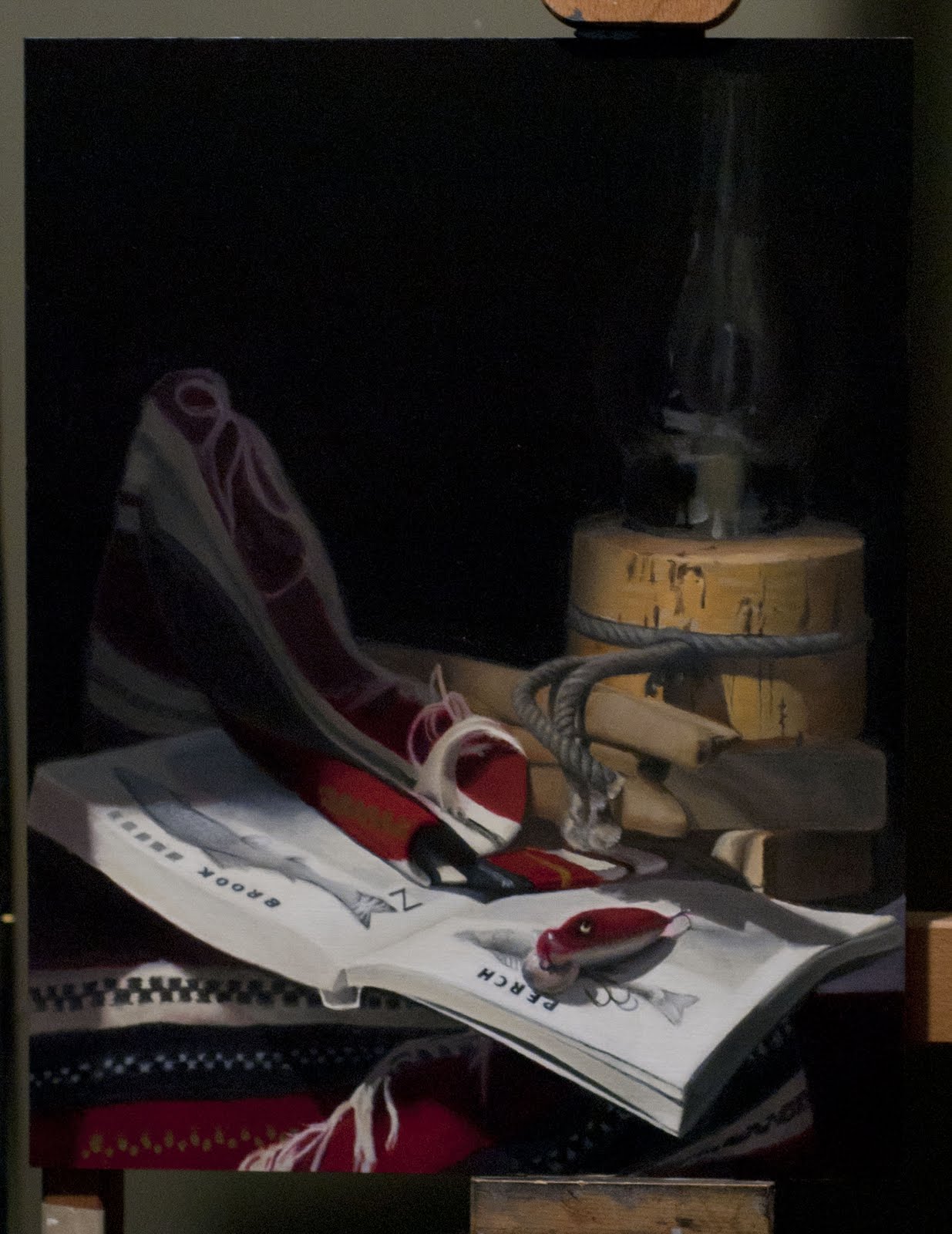
Working towards an end to the Fishing Scene

Wow. I haven't posted an update to this painting for nearly three months! But I've been toiling away once a week on the final stage called "second painting", which for me is mostly about blending surfaces, creating textures, softening edges and applying tints and glazes. Over time, the dark areas sink in as the paint dries and the oils/mineral spirits evaporate. Then, when you reach an area that borders a dark area, you need to freshen up the border with some oil so you can see what colour the dark area was before it dried...

I just finished working the base of the cork lantern. I approached it much like I would a human face in the same lighting conditions. The darkest areas have warm shadows, the half-tones are cool, the front is warm again, and any ridges catching the direct light are cool. A layer of grey dust has settled on everything after months of sitting in the studio, so I went back and cooled things down a bit. The face of the cork was made with a burnt sienna to give it an orange glow but I had to dull that down by mixing it its complementary, green umber. The umber was more effective than the neutral grey I had been mixing months before.


Most of the big areas around the book are done. I just have to "second paint" the area below where the rope ends dangle, and then go back to the surface of the book. The red lure is fine except for an unintentional white halo around its top edge, which I'll make disappear.  The last bit will be the lettering, which I dread...

Just a few more weeks to go, I think. And just in time too. Gravity is taking its toll. In the setup the blanket has fall down and the red lure has jumped off the page and onto the floor more than once. I can't blame it really. 

Sunday, August 7, 2011

Update on Holbein's Thomas More copy

"What I did on my summer vacation"  Never enough but in a few short words I started repainting the face, fur, gold chain and drapes...

I started on the drapes two days ago, working from right to left and stopping just above the cap. What I'm trying to do is in this pass is to get a better sense of the shape of folds on the cloth moving in and out of the light... At the same time, I'm taking out some of the chroma in the original sap green, dulling it down with gray.  Strangely, in the original, the "greenness" also varies considerably from one side to the other, as if the artist didn't quite get a consistent mix. Plus it looks as the he either used very thin washes of green (to save money?) or that the green was stripped away after multiple cleanings. In photos of Holbein's painting, I can see right through the green down to the gesso layer plastered on top of the oak panel.

The fur has been very easy to render but the golden letter "esses" and the pair of tiny chain linking them are torture for me. I've blocked them in quickly but need to resize each one so they're consistent, even as they twist and rotate around the neck. In the original, they're modelled like pieces of chiselled metal with bevelled edges. As they move into the darkness at the shoulders, the gold areas of the letters become smaller and the bevelled edges in burnt sienna become more prominent; the curves in the "esse" shift as well. There's so much care taken in Holbein's painting of these small details that he must have spent a considerable amount of timing getting it just right... Each letter "esse" is truly unique.

The hands will be treated next...

Wednesday, June 8, 2011

A Yellow Lure for the Fishing Scene

I've added the final element to this painting: the yellow lure suspended above the book between the lamp and the fabric. This was the colour anomaly that is intended to add "life" to this still life. Tonight I applied a second coat over the first one that wasn't masking the dark background very well (Most yellows are transparent; I had to find an opaque one called Naples Yellow and add some Flake White to cover the black background adequately.)  With everything painted "once", the second painting stage has now begun and I'll be concentrating on blends and edges...


Below is a photo of my set up tonight. The dark background which weeks ago was fresh has now sunk in to a matte colour. It will come alive again when I paint over it once more with

Holbein - Colour, Values, Detail

In previous weeks, I've been working solely on the drapery, the robe, and in particular the velvet red arms -- leaving the skin colouring in the face for another day. The arms were easier than I thought. I used Cadmium Red Deep with pure Cadmium for the highlights.  In most online reproductions I've seen of this painting, the robe appears to be pure, solid black, which isn't likely given the light thrown on the figure. I decided to give it an indigo tint, just like the hat, to help bring out some of the folds.  I took the photo below outdoors and suddenly the green background seemed much brighter than I intended.

So on the next pass, each area will go several values deeper.  I have to concentrate on the darkest darks before moving into the lighter areas to get the correct range of values.


I made a start on the centre of the golden chain of office and will slowly lay out the basic shape before honing in on the details (close up below)... And there are exquisite details: a series of esses linked by chains, coming together at the centre with a Tudor rose strung .  It is supposed to be made of up a chain of esses, a pair of portcullises, from which hang a Tudor Rose, a combination of  the red rose of Lancaster and white rose of York.  As I'm painting the pedals, I can imagine a rose within a rose... 


Curiously, in other areas like the drapery, the paint layer is very thin. Either Holbein did it very quickly, trying to conserve paint, or conservators stripping the varnish to clean the painting pulled away some of the green.  What's left is very transparent.

Saturday, May 21, 2011

Painting Glass

This past week, I repainted the background a warmer dark value and took the opportunity to paint the glass lantern. I've learned that painting glass is mostly about painting the reflections. Anything that's not a reflection has to be the background behind the glass. This particular lamp is getting dusty on all sides, having sat in the same place for the last 5 months, so I have to take that into account... The lamp also has a few drops of melted wax in front, and I've added them here.


When I return to this painting, the background should be dry. I'm then going to add the final touch before moving on to the final stage of this painting. The missing element is the yellow and red lure that will dangle  down the front between the blanket and the lamp, above the book.

Monday, April 25, 2011

Holbein Master Copy -- a new picture in progress

I started this project last fall. It will be a master copy of Holbein's Thomas More, painted to scale. The detail in the velvut cuffs, the fur collar and the stubble in the face are amazing. And learning how to paint them is the challenge I've taken on.

For the first time ever, I made use of an old fashioned "squaring up" technique: I drew a grid over a print that I bought years ago at New York's Frick Gallery and then drew a similar grid over my 24" by 30" canvas.

I've been concentrating on getting the face right and still have some minor adjustments to make to the jaw line. The real challenge though will be colour and I'm going to worry about it later. No two prints I've seen are alike and most that I have make the skin too yellow and the curtain too vibrant a green. Each print also brings out different details in each area, so I'm drawing on more than one version...


Version 1: Downloaded from the Google Art Project and its tour of the Frick Gallery in New York, where this painting hangs.

Version 2: Downloaded from the respected http://www.artrenewal.org/ archive of classical works.


Version 3: Downloaded from an internet picture archive


Wednesday, April 20, 2011

Brook Trout and Rope

I've left the perch alone for now. The word not the fish. A couple of sessions ago, I repainted "Perch" by first laying down small black boxes to represent where each letter needs to go. After adjusting the vertical and horizontal angles of the sides for each letter, I slowly began carving them out. That seemed to be the more efficient approach. They still need some fine tuning, but I'll do that at the "second painting" stage, which I'm close to beginning.

As you'll see from the image below, I've started blocking out the second set of letters: "Brook Trout". And I've begun to mess more with the rope, warming it up and making it a bit more ragged. The last thing I'll do before starting second painting is to fix the colour of the cork lantern and give the background another dark coat. The next one will be warmer, unlike our spring weather.

Sunday, April 3, 2011

The trouble with Perch -- the word, not the fish

While working on smaller areas these last few weeks, my book has begun to sag on the stand. The front corner has actually "wilted" bit, so I've taken time to reshape the right page and need many more coats of white to mask the previous corner.  I've laid out one fish (a perch) on that page and have started giving shape to the one on the opposite page.

Painting words is proving more of a challenge than I imagined. I have to wipe out my first attempt at "P E R C H" and try again, this time using a rule to approximate 2 point perspective and block in the approximate positions of the letters. The vertical sides of the letters need to recede off to the right (and they would merge at some imaginary vanishing point to the upper far right). The horizontal sides of the letters also need to appear to follow an imaginary vanishing point on the left. What this is supposed to mean to me is that the tops of the letters are bigger/fatter than the bottoms of the letters. And the P should be taller than the H. When I stand directly in front of the book, the verticals do seem to line up with the edges of the page. But from my viewpoint 7 feet in front of my still life (looking directly at the corner of the page), the book sags, bending and distorting the edges of the page... What a pain.

I also need to revisit the cork. The right side is too cool. I was trying to follow the rule of painting skin, which is "cool, warm, cool, warm" -- cool highlights, warm in the lights, cool in the halftones, and warm in the lights. But in my last attempt, I mistakenly enlarged the cool half-tones and I need to make them thinner and return the warm darks to the  farthest side.

The background (now sunken in) will also be repainted later in a warmer tone...


Sunday, March 6, 2011

Tenebrist Update -- Rope is hard. Cork is easy.

I've spent the last few weeks darkening the background areas and that's helped make the front of the book appear closer. I won't be able to achieve the brightness of the white page that you would see in real life, but there are still some things to do that will help... With each session, I make minor improvements to the drawing as I concentrate on smaller and smaller areas... Firm conclusion: rope is hard, cork is easy.


I made a slight modification to the set up by rehanging the yellow lure on wire instead of fishing line and leader so that I can more easily manipulate its position. It's now slightly higher and to the right so it doesn't obscure the edge of the carpet moving forward out of the shadows.  This lure will definitely be the last thing I paint.


Monday, February 21, 2011

Tenebrist still life -- a report in photos of my progress in the last six weeks

This is my first post since the start of winter.  Here's a reminder of what the set up looks like. I took this photograph last Saturday using a tripod that's slightly shorter than I am and the whites are showing brighter here than they actually are.


Below:
Progress as of February 19th. I spent this day repainting the background and adding the glass on the lamp while I was at it.  I still have a long way to go but seem to move faster each week.


From February 7: Redrawing the lure, building up the paper on the book, and touching up the area underneath the book to correct values and colour.


January 21: my first go at the lure.


January 15: Adding the rope and other shapes...