
Showing posts with label Still Life #2 in Oil. Show all posts
Showing posts with label Still Life #2 in Oil. Show all posts
Saturday, October 15, 2011
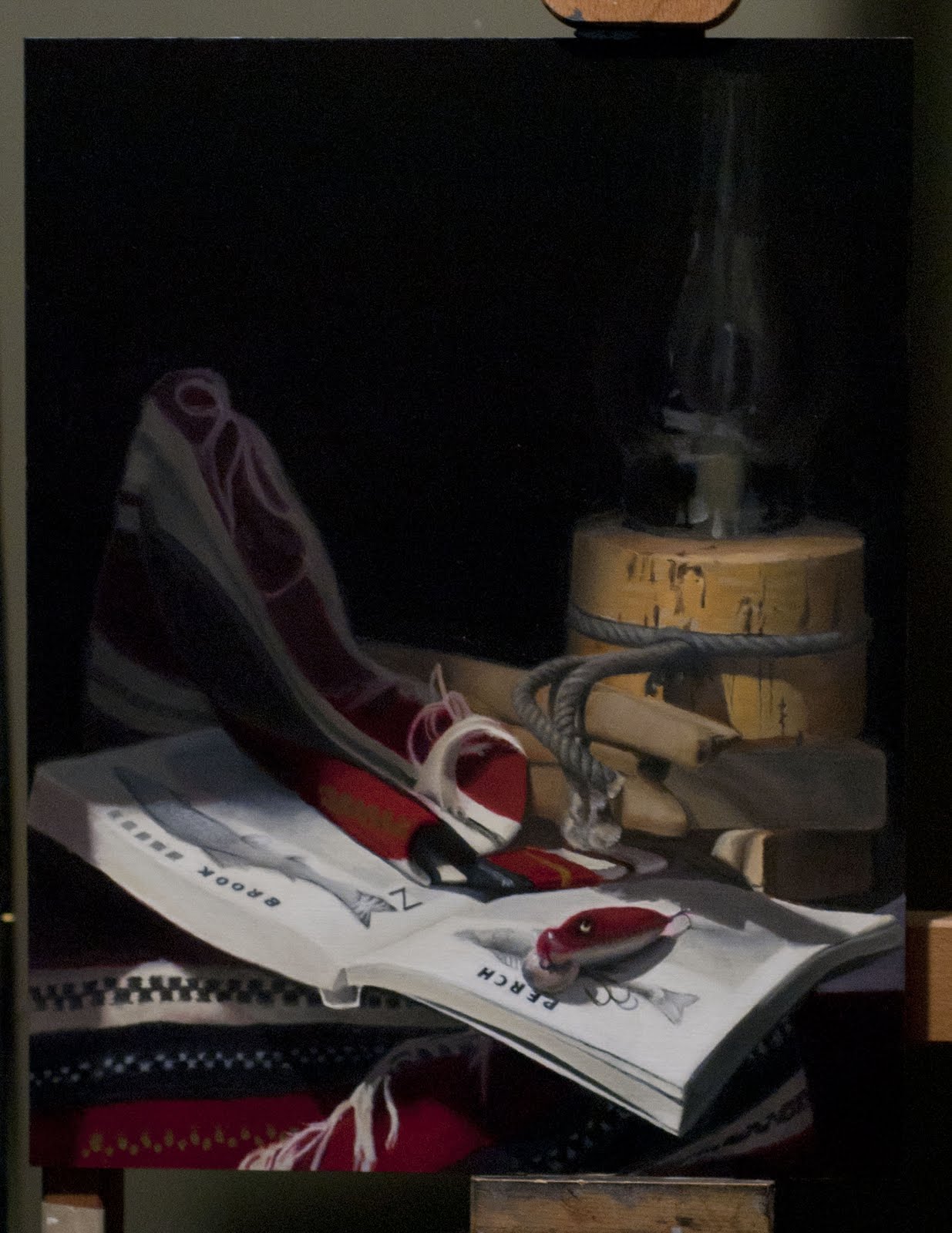
Fishing Still Life -- Finished
It's now finished and home drying. And I can turn to other projects at last. I think this is the one and only time I'll ever attempt to paint printed words upside down on warped pages.

Wednesday, June 8, 2011
A Yellow Lure for the Fishing Scene
I've added the final element to this painting: the yellow lure suspended above the book between the lamp and the fabric. This was the colour anomaly that is intended to add "life" to this still life. Tonight I applied a second coat over the first one that wasn't masking the dark background very well (Most yellows are transparent; I had to find an opaque one called Naples Yellow and add some Flake White to cover the black background adequately.) With everything painted "once", the second painting stage has now begun and I'll be concentrating on blends and edges...

Below is a photo of my set up tonight. The dark background which weeks ago was fresh has now sunk in to a matte colour. It will come alive again when I paint over it once more with


Below is a photo of my set up tonight. The dark background which weeks ago was fresh has now sunk in to a matte colour. It will come alive again when I paint over it once more with

Saturday, May 21, 2011
Painting Glass
This past week, I repainted the background a warmer dark value and took the opportunity to paint the glass lantern. I've learned that painting glass is mostly about painting the reflections. Anything that's not a reflection has to be the background behind the glass. This particular lamp is getting dusty on all sides, having sat in the same place for the last 5 months, so I have to take that into account... The lamp also has a few drops of melted wax in front, and I've added them here.

When I return to this painting, the background should be dry. I'm then going to add the final touch before moving on to the final stage of this painting. The missing element is the yellow and red lure that will dangle down the front between the blanket and the lamp, above the book.
Wednesday, April 20, 2011
Brook Trout and Rope
I've left the perch alone for now. The word not the fish. A couple of sessions ago, I repainted "Perch" by first laying down small black boxes to represent where each letter needs to go. After adjusting the vertical and horizontal angles of the sides for each letter, I slowly began carving them out. That seemed to be the more efficient approach. They still need some fine tuning, but I'll do that at the "second painting" stage, which I'm close to beginning.
As you'll see from the image below, I've started blocking out the second set of letters: "Brook Trout". And I've begun to mess more with the rope, warming it up and making it a bit more ragged. The last thing I'll do before starting second painting is to fix the colour of the cork lantern and give the background another dark coat. The next one will be warmer, unlike our spring weather.

As you'll see from the image below, I've started blocking out the second set of letters: "Brook Trout". And I've begun to mess more with the rope, warming it up and making it a bit more ragged. The last thing I'll do before starting second painting is to fix the colour of the cork lantern and give the background another dark coat. The next one will be warmer, unlike our spring weather.

Sunday, April 3, 2011
The trouble with Perch -- the word, not the fish
While working on smaller areas these last few weeks, my book has begun to sag on the stand. The front corner has actually "wilted" bit, so I've taken time to reshape the right page and need many more coats of white to mask the previous corner. I've laid out one fish (a perch) on that page and have started giving shape to the one on the opposite page.
Painting words is proving more of a challenge than I imagined. I have to wipe out my first attempt at "P E R C H" and try again, this time using a rule to approximate 2 point perspective and block in the approximate positions of the letters. The vertical sides of the letters need to recede off to the right (and they would merge at some imaginary vanishing point to the upper far right). The horizontal sides of the letters also need to appear to follow an imaginary vanishing point on the left. What this is supposed to mean to me is that the tops of the letters are bigger/fatter than the bottoms of the letters. And the P should be taller than the H. When I stand directly in front of the book, the verticals do seem to line up with the edges of the page. But from my viewpoint 7 feet in front of my still life (looking directly at the corner of the page), the book sags, bending and distorting the edges of the page... What a pain.
I also need to revisit the cork. The right side is too cool. I was trying to follow the rule of painting skin, which is "cool, warm, cool, warm" -- cool highlights, warm in the lights, cool in the halftones, and warm in the lights. But in my last attempt, I mistakenly enlarged the cool half-tones and I need to make them thinner and return the warm darks to the farthest side.
The background (now sunken in) will also be repainted later in a warmer tone...

Sunday, March 6, 2011
Tenebrist Update -- Rope is hard. Cork is easy.
I've spent the last few weeks darkening the background areas and that's helped make the front of the book appear closer. I won't be able to achieve the brightness of the white page that you would see in real life, but there are still some things to do that will help... With each session, I make minor improvements to the drawing as I concentrate on smaller and smaller areas... Firm conclusion: rope is hard, cork is easy.

I made a slight modification to the set up by rehanging the yellow lure on wire instead of fishing line and leader so that I can more easily manipulate its position. It's now slightly higher and to the right so it doesn't obscure the edge of the carpet moving forward out of the shadows. This lure will definitely be the last thing I paint.


I made a slight modification to the set up by rehanging the yellow lure on wire instead of fishing line and leader so that I can more easily manipulate its position. It's now slightly higher and to the right so it doesn't obscure the edge of the carpet moving forward out of the shadows. This lure will definitely be the last thing I paint.

Monday, February 21, 2011
Tenebrist still life -- a report in photos of my progress in the last six weeks
This is my first post since the start of winter. Here's a reminder of what the set up looks like. I took this photograph last Saturday using a tripod that's slightly shorter than I am and the whites are showing brighter here than they actually are.

Below:
Progress as of February 19th. I spent this day repainting the background and adding the glass on the lamp while I was at it. I still have a long way to go but seem to move faster each week.

From February 7: Redrawing the lure, building up the paper on the book, and touching up the area underneath the book to correct values and colour.

January 21: my first go at the lure.
 January 15: Adding the rope and other shapes...


Below:
Progress as of February 19th. I spent this day repainting the background and adding the glass on the lamp while I was at it. I still have a long way to go but seem to move faster each week.

From February 7: Redrawing the lure, building up the paper on the book, and touching up the area underneath the book to correct values and colour.

January 21: my first go at the lure.


Sunday, November 14, 2010
New Still Life -- Tenebrist Design with a Fishing Theme
Below is a photo of the setup for the next still life... There are 2 requirements for this project:
1. Tenebrist lighting. The Wikipedia definition of tenebrism is this: "from the Italian tenebroso ("murky"), (also called dramatic illumination) is a style of painting using very pronounced chiaroscuro, where there are violent contrasts of light and dark, and darkness becomes a dominating feature of the image."
2. Something with writing on it.
I choose these objects or "characters":
I spent 2 Saturday afternoons toying with this set up. In my first composition, the cork lantern was central and the driftwood came out from the right. This time, I shifted the lantern to the right, and then changed some of the diagonals. But the biggest change was the introduction of the yellow jure as the colour anomaly -- an object that doesn't look like it belongs and so when it appears the eye jumps to it.
I've placed my yellow lure slightly off centre and hanging down from the top of the box. My camera on its tripod wasn't at my eye level and it tended to focus on the lure as the closest object, making it seem larger. It's actually smaller! In the final setup, I also changed the positioning of the blue cord and the red lure slightly.

1. Tenebrist lighting. The Wikipedia definition of tenebrism is this: "from the Italian tenebroso ("murky"), (also called dramatic illumination) is a style of painting using very pronounced chiaroscuro, where there are violent contrasts of light and dark, and darkness becomes a dominating feature of the image."
2. Something with writing on it.
I choose these objects or "characters":
- a cork lantern with tattered blue cord at its base, propped up on wood blocks
- a piece of old driftwood that looks like a petrified pike with its mouth open (but no teeth)
- red, black, and white cloth from the Ukraine
- an Ontario nature book open at a page showing an image and description of two fish -- a perch and a rainbow trout
- an old wooden fishing lure that is red on the top and has two beady eyes
- a bright yellow/red lure that has seen better days.
I spent 2 Saturday afternoons toying with this set up. In my first composition, the cork lantern was central and the driftwood came out from the right. This time, I shifted the lantern to the right, and then changed some of the diagonals. But the biggest change was the introduction of the yellow jure as the colour anomaly -- an object that doesn't look like it belongs and so when it appears the eye jumps to it.
I've placed my yellow lure slightly off centre and hanging down from the top of the box. My camera on its tripod wasn't at my eye level and it tended to focus on the lure as the closest object, making it seem larger. It's actually smaller! In the final setup, I also changed the positioning of the blue cord and the red lure slightly.

Subscribe to:
Posts (Atom)

