
Showing posts with label Still Life #1 in Oil. Show all posts
Showing posts with label Still Life #1 in Oil. Show all posts
Thursday, October 28, 2010
Final touches for Still Life #1
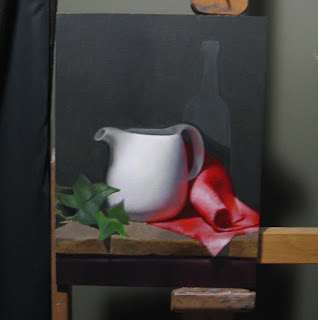
I've been putting some finishing touches on this still life, including lightening up areas of the background instead of keeping it one solid colour. The greens in the bottle have been drying at different rates and the camera itself is picking that out as well. When the area dries, the bottle should sit more quietly in the background. The final thing I want to do is to improve the blending in the spout -- my old brushes were making that difficult. That's all that's left before calling it quits and taking the tea pot home.

Wednesday, October 13, 2010
Red, White and Green Still Life -- nearing completion...
I've spent the last few sessions on small details, softing and hardening edges to bring things to a final finish.
Last night I repainted the bottle, first oiling in the surrounding area so that I could see again the paint that has already sunk in. I still need to lose the edge on the left side or at least make it more symmetrical with the right, even though I've been painting it exactly the way I see it. The other things left on my To Do List include:

Last night I repainted the bottle, first oiling in the surrounding area so that I could see again the paint that has already sunk in. I still need to lose the edge on the left side or at least make it more symmetrical with the right, even though I've been painting it exactly the way I see it. The other things left on my To Do List include:
- repainting the highight on the tea pot again using white mixed with stand oil to make it both brighter and more opaque than a regular glaze
- smoothing the finish on the spout
- adding a grey glaze to the top of the roll on the red cloth (genuine dust has accumlated now)
- repainting the tea pot's handle, especially the edges that meet the background

Wednesday, September 1, 2010
Fresh background for the still life
I spent last night resaturating the background with a solid, fresh layer of ivory black/pale yellow ochre (which makes the green of the wall) and linseed oil, and blending it into the edges of the bottle. I also took the opportunity to repaint the bottle with a higher chroma green (Sap Green) and to lose some of its edges into the wet background. I'm not so concerned now with getting a symmetrical shape and the outline of the real bottle does get lost in places. But I still have to see how things look after the paint dries. In the meantime, I'll move on to other areas...


Sunday, August 22, 2010
Update on the Red, White and Green Still Life

I painted the wine bottle in yesterday, using only high chroma greens (vermillion, sap green, and a bit of pale yellow ochre -- no white). Trouble is, the real green background (a mix of ivory black and pale yellow ochre) has long since sunk into the panel so I haven't really been able to blend the bottle back in. In the next session, I'll repaint the background with the green and linseed oil and blend the edges of the bottle into it. I also need to make the outline of the bottle more symmetrical, even though the real bottle is flawed (I keep insisting it is, anyway). One trick suggested: on the computer, trace the outline of one side, then flip it over and lay it over the other side. That should tell me how to correct the other side.
The red cloth just needs a few minor touches. The far right edge needs to be darker and greyer to suggest that it's receding in the distance. This should help make the front of the cloth jump out even more. Other final touches: repainting the leaves and toning down the highlights, and adding a few more scratches/eteches into the edge of the board.
Monday, June 14, 2010
Indirect Painting for Texture
The still life at the school is progressing. Nearly every area is ready now for the second painting stage except for the cloth. In the winter, I painted several layers of white over areas of the the red (an indirect painting technique) to create the foundation for highlights, primarily on the front flap and the middle of the roll. Later I applied several glazes of red back over the white areas, and then the highlights I wanted emerged. What I didn't get was a sense of texture. The cloth has a strong weave in two directions and its edges are very frayed. I should have built that texture into my original layers of white when doing the indirect painting because I can't achieve it with the cadmium red paint on its own. So I'm back at it again. Over the last month, I've applied several fine white lines and white blobs to mimic the pattern. Now when I re-glaze it with red the pattern should be retained... We'll see.


Saturday, April 17, 2010
When Oil Paint goes to sleep
A few weeks ago, I decided to repaint the background and especially the bottle. I hadn't touched my background since I first laid down the dark greens and it was bothering me, especially where the bottle meets the cloth. The bottle has its own rich local colour, a kind of cool, bluish green that differs from the green wall, and yet it sits in front of the wall so some of the wall has to be seen inside the bottle. Later, highlights and reflections will be added to the bottle.
What surprised me was how quickly the background dried and then faded away into the linen. It's now a kind of dull matte and the bottle green is almost lost in the wall green. Apparently, the expression used is that the paint has gone "dormant" and won't reawaken until it is varnished.
The first photo below shows what the background looked like immediately after I applied it. The second shows the impact of drying, one week later.


Sunday, March 28, 2010
Colour Mixing
While I'm ever so slowly building up the colour again on the clothe with successive glazes of cadmium red, I'm stopping to let the other areas of the painting catch up. First the leaves. The chroma has been too intense a green for several weeks. I tried several different mixtures to dull the chroma. Adding cadmium orange, and later burnt umber, didn't work for me. In theory, the compliment of red in the burnt umber or a close complimentary in orange should have done the trick, but only made them "hotter". So I think mixed a range of neutral grey values and added each to the range of greens on my largest leaf -- in equal measure... And now the greens are cooling off.
This week I'm going to tackle the background. It only has a first thin layer of dead colour on it. The correct recipe for the background green is ivory black + yellow ocre + some burnt umber... We debated at the school whether I should paint over the outline of the bottle completely and then paint the bottle on top. Bottle, being transclucent, would have some background green showing throw... But it in the real life set up, it's a different green (blue green, mostly vermillion) and the right edge of it is very prominent. So the consensus is to paint the bottle as I see it at the same time as the background and then blend the edges in. One edge I need to deal with a.s.a.p is the place where the clothe recedes into the background. I have yet to turn it away from the front and blend it into the green wall.

This week I'm going to tackle the background. It only has a first thin layer of dead colour on it. The correct recipe for the background green is ivory black + yellow ocre + some burnt umber... We debated at the school whether I should paint over the outline of the bottle completely and then paint the bottle on top. Bottle, being transclucent, would have some background green showing throw... But it in the real life set up, it's a different green (blue green, mostly vermillion) and the right edge of it is very prominent. So the consensus is to paint the bottle as I see it at the same time as the background and then blend the edges in. One edge I need to deal with a.s.a.p is the place where the clothe recedes into the background. I have yet to turn it away from the front and blend it into the green wall.

Tuesday, March 23, 2010
Indirect Painting again -- three Saturdays
I'm still learning about this method called indirect painting. For a couple of weeks in a row, I've built up a layer of opaque white on the red cloth. The whitest white is supposed to represent the brightest part of the cloth, a brightness that can't be achieved any other way. The white painting sitting on top of my previous layers of cadmium red became quite tacky and slow to dry. I finally achieved what was needed on March 6th. A week later it was dry enough to put a thin layer of cadmium red back on top (March 13th). Finally, last week (March 20th), I added a second glaze of cadmium red and began trying to model the shape of the roll in the cloth, as well as the cloth's shadows. The shadows are a mixture of Alizarin Crimson and Cadmium Red. The lightest areas of the roll are probably as light now as I need them to be and I can darken the edges and the shadows in the next few weeks...
Saturday March 6

Saturday March 13

Saturday March 20

Mixing the green in the leaves has been another challenge. While it's easy to mix a solid green of high chroma (a "green" green), it's more difficult to tone down that greenness to make it seem more natural. I have the values correct, but my leaves are oppresively green. I first added Cadmium Orange to my mix, but that resulted in an odd warming effect, like a leaf in autumn about to turn. What I need to do is mix in Burnt Umber, whose "redness" is the complimentary of green and will "grey down" the green. Another way of achieving the same thing is to mix in a neutral "grey" (made by combining ivory black, raw umber, and white). An infusion of grey drains a colour of its chroma -- in my case, it should dull down the green very quickly.
I'll take some close-ups next time. These pictures were taken about 10 feet back from the easel and then cropped...
Saturday, February 20, 2010
Indirect Painting -- getting a start on it
Today, I moved on modelling the white pot, laid down some fresh green on the leaves, and then got a start on something new with the cloth: Indirect Painting.
Background: Some colours are so bright and intense that there's no way to mix the paint to achieve realistic highlights. If you merely mix white and red to achieve a lighter red, pink will result. The same thing will happen with some bright greens, blues, and violets. In my still life exercise here, I have a bright red cloth (almost pure cadmium red) with a large roll in it. I tried modelling the lightest part of the roll with cadmium orange and yellow mixed in with the red, but even that didn't brighten up the area in the way I wanted... So that's why indirect painting has to be done.
Here's the general idea: To achieve highlights, a coat of white is put down first over the original local colour (cadmium red). When the white dries, glazes of red are reapplied and the white shines through, not as pink but as a lighter red.
To begin, the original layer of red must be completely dry so that the fresh white doesn't combine with it to make pink. A small test confirms this. Next, pure white is added in all areas where the cloth is a lighter red than its local colour, in my case pure cadmium red, a perfect 5 on the value scale of 0 to 9. Where the red cloth is at its lightest, I applied the white paint at its full intensity. (Note: Juan recommended mixing some calcium carbonate to my flake white to ensure it would be as opaque as possible). As I move from the lightest red to the local colour red, I thin out and blend the white paint towards the pure red.
Two brushes are needed: one to lay down the pure white, and one absolutely clean brush to blend it out and lift it off as your move to the darker reds... (The mantra I think is: brush in, brush out)
In my picture below, the whitest whites are where the cloth shows off the lightest reds...
In two weeks' time, this white will be dry. Then I'll begin adding glazes of red on top. There no harm in having the white too white; I can always darken later. But the reverse is not true: If after applying the red glazes I find that the highlights are not bright enough because the white underneath was not opaque enough, then tough luck. It's too late to fix it.
Background: Some colours are so bright and intense that there's no way to mix the paint to achieve realistic highlights. If you merely mix white and red to achieve a lighter red, pink will result. The same thing will happen with some bright greens, blues, and violets. In my still life exercise here, I have a bright red cloth (almost pure cadmium red) with a large roll in it. I tried modelling the lightest part of the roll with cadmium orange and yellow mixed in with the red, but even that didn't brighten up the area in the way I wanted... So that's why indirect painting has to be done.
Here's the general idea: To achieve highlights, a coat of white is put down first over the original local colour (cadmium red). When the white dries, glazes of red are reapplied and the white shines through, not as pink but as a lighter red.
To begin, the original layer of red must be completely dry so that the fresh white doesn't combine with it to make pink. A small test confirms this. Next, pure white is added in all areas where the cloth is a lighter red than its local colour, in my case pure cadmium red, a perfect 5 on the value scale of 0 to 9. Where the red cloth is at its lightest, I applied the white paint at its full intensity. (Note: Juan recommended mixing some calcium carbonate to my flake white to ensure it would be as opaque as possible). As I move from the lightest red to the local colour red, I thin out and blend the white paint towards the pure red.
Two brushes are needed: one to lay down the pure white, and one absolutely clean brush to blend it out and lift it off as your move to the darker reds... (The mantra I think is: brush in, brush out)
In my picture below, the whitest whites are where the cloth shows off the lightest reds...

In two weeks' time, this white will be dry. Then I'll begin adding glazes of red on top. There no harm in having the white too white; I can always darken later. But the reverse is not true: If after applying the red glazes I find that the highlights are not bright enough because the white underneath was not opaque enough, then tough luck. It's too late to fix it.
Tuesday, February 16, 2010
Still Life continues...
The last two weeks, I've been working right to left, with a focus on the right half of the tea pot and cloth. I now need to finish reshaping the spout -- pushing it up and lengthening it -- and pushing in the pot's top left side. Next step will be to improve on the pot's colour (there should be more brown around the spout and less green; plus more purple on the top right side and less grey). Finally, I'll move onto the leaves, which still have their thin layer of dead colour. Things are moving along...


Sunday, January 31, 2010
Red reflection in the teapot
This week, I concentrated on the teapot, trying to model the shadows while also building up the shadows of the cloth alongside. The teapot is still too "blue", so I've been repainting it with some yellow ochre mixed into the white in the lightest areas, and raw umber in the shadow areas. That's a work in progress -- I haven't done anything yet around the spout, which is still too grey. I'll be adding some green to that side.
The red reflection on the right side does complicate things. It reaches up into the half-tones of the shadows in the teapot more than I appreciated before. On my first go, the underlying red shone through beautifully over a layer of grey that I had added. But now the grey has dried too opaque, and so I need to go back over it with a glaze of cadmium red again. This coming week, I'll be building up the shadows of the cloth and redrawing the contour of the pot on the right side. The shadow will be built up with pure Alizorin Crimson. Juan also suggested blending some Alizorin Crimson and Cadmium Red to create some of the frayed ends of the cloth, particularly in the spot where the cloth rolls.

The red reflection on the right side does complicate things. It reaches up into the half-tones of the shadows in the teapot more than I appreciated before. On my first go, the underlying red shone through beautifully over a layer of grey that I had added. But now the grey has dried too opaque, and so I need to go back over it with a glaze of cadmium red again. This coming week, I'll be building up the shadows of the cloth and redrawing the contour of the pot on the right side. The shadow will be built up with pure Alizorin Crimson. Juan also suggested blending some Alizorin Crimson and Cadmium Red to create some of the frayed ends of the cloth, particularly in the spot where the cloth rolls.

Saturday, January 23, 2010
Strange beginning
My still life has had a strange beginning, it seems to me. But I've been following the correct approach. The current phase goes by three names used interchangeably.

The red cloth is what gives this phase its strangeness for me. Wherever it sits, whether in light or in shadow, it has to be given a strong underpainting of its local colour, almost pure Cadmium Red. The reason is, I'm told, I'll never have another chance to give it its true "redness"-- it's all shadows of Alizorin Crimson and tints of Tintanium White after this. The red cloth is also reflected along the side and bottom of the teapot, and so it too gets a treatment of Cadmium Red too, although I haven't done a good job yet of blending it with the teapot's local colour.
At this moment then, I have a large red blob on the panel, much larger than the equivalent red that will be seen in the finished painting. I can still see the boundaries of my drawing for shadows and the edge of the pot, so that hasn't been lost.
The white teapot also needs more work because it isn't really a white. I did a quick lay in with variants of grey, but it's obviously too cool a grey. It should have been mixed with raw umber as well for the shadow areas (especially bottom) and a dash of yellow ochre for the centre. Next time.
One other note I forgot to document. When I first started, I wanted to go from the centre out, light to dark. This was wrong. The dark values are needed first around the teapot to know how light it really is. And so the background top, sides, and bottom were completed first.
- Dead Colour: the paint you first apply gets soaked up by the "ground" of the panel or canvas, leaving it looking rather dull. Yup.
- Local Colour: the goal is to paint the true colour of the objects. That is, the colour you'd see if there were no lights and shadows and reflections changing the colour of the object. It's almost impossible to get this right so they just tell us to put down whatever you can,
- First Inlay: Add a thin layer the consistency of house paint, and then let it dry. It's tempting to want to fix the colour at your first go while it's still fresh, but then you make the mistake of doubling the layer of paint.

At this moment then, I have a large red blob on the panel, much larger than the equivalent red that will be seen in the finished painting. I can still see the boundaries of my drawing for shadows and the edge of the pot, so that hasn't been lost.
The white teapot also needs more work because it isn't really a white. I did a quick lay in with variants of grey, but it's obviously too cool a grey. It should have been mixed with raw umber as well for the shadow areas (especially bottom) and a dash of yellow ochre for the centre. Next time.
One other note I forgot to document. When I first started, I wanted to go from the centre out, light to dark. This was wrong. The dark values are needed first around the teapot to know how light it really is. And so the background top, sides, and bottom were completed first.
Monday, December 7, 2009
Still Life Underway
It has taken a while to get going... The first obstacle was choosing and finding an appropriate "canvas" to paint on. Store-bought primed and stretched canvas, while cheap, proved to be disappointing (made in China). I stretched my own canvas and primed it 3 more times, and the result was much better... But then I was persuaded to try painting on the best possible linen, primed with lead white (which won't flake or yellow)and mounted on archival-quality panels.
I bought and imported 2 ready-made boards from the States (New Traditions Panels), shown below. The first is baltic birch, sealed on the back with a triple coat of Polyurethane to keep the moisture out and minimize warping. The second is Dibond, a sturdy archival aluminum composite material made of two lightweight sheets with a thermal plastic core. Conservators recommend this panel because it's not supposed to warp.
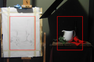
The second obstacle was getting the canopy installed above the objects to create the shadows I want. Once that was done, I was able to finish the cartoon. Although I could have drawn directly on the panel with paint, I wasn't entirely certain how I would end up positioning the drawing. And so a paper cartoon gave me a chance to make changes without consequences. In the end, I made the drawing vertical and chose new dimensions: 12" wide by 16" tall.
In the photo below, the red squares represent the "Frame". After I snapped the picture, I noticed that tape holding up the red cloth behind the tea pot had fallen off, so the cloth is flatter than it should be...
As an experiment, I tried a different approach to transferring the cartoon to the panel. I first coated the paper with raw umber. The oil in the paint was soon absorbed, leaving only the pigment. I then positioned the cartoon over the panel and retraced the drawing with a knitting needle. The end result is below. It's cleaner than if I had used charcoal (the usual approach).

I bought and imported 2 ready-made boards from the States (New Traditions Panels), shown below. The first is baltic birch, sealed on the back with a triple coat of Polyurethane to keep the moisture out and minimize warping. The second is Dibond, a sturdy archival aluminum composite material made of two lightweight sheets with a thermal plastic core. Conservators recommend this panel because it's not supposed to warp.


The second obstacle was getting the canopy installed above the objects to create the shadows I want. Once that was done, I was able to finish the cartoon. Although I could have drawn directly on the panel with paint, I wasn't entirely certain how I would end up positioning the drawing. And so a paper cartoon gave me a chance to make changes without consequences. In the end, I made the drawing vertical and chose new dimensions: 12" wide by 16" tall.
In the photo below, the red squares represent the "Frame". After I snapped the picture, I noticed that tape holding up the red cloth behind the tea pot had fallen off, so the cloth is flatter than it should be...

As an experiment, I tried a different approach to transferring the cartoon to the panel. I first coated the paper with raw umber. The oil in the paint was soon absorbed, leaving only the pigment. I then positioned the cartoon over the panel and retraced the drawing with a knitting needle. The end result is below. It's cleaner than if I had used charcoal (the usual approach).

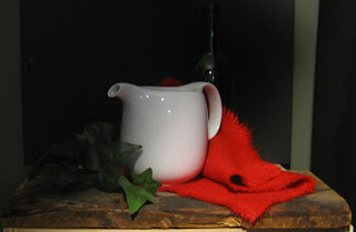
Thursday, October 15, 2009
Still Life -- final arrangement, but without lighting
This hasn't been easy but I've settled on a design for the first still life.
I was required to find 3 white, red, and green objects. In this exercise, there are only 2 objectives: to learn how to paint a shiny surface with colour reflections (in this case a white teapot) and to learn the indirect method of painting (the bright red napkin). The napkin is almost the colour of pure cadmium red and cadmium orange combined. Apparently, there's no way to create a full range of lights/darks in a cadmium red object without using a different technique. The normal technique would be to mix white and red together first to create a lighter value, but this only produces "pink". So the indirect technique is to paint something white FIRST and then apply glazes of cadmium red on top until the correct value is achieved...
The green is purely incidental. I was going to choose a set of plastic green grapes but was advised that they'd end up looking plastic. So then I experimented with a plastic leaves and settled on this branch of ivy. The green wine bottle in the background will be in shadow and I may pull it out entirely.
The board was suggested by an instructor as a means of adding texture that would contrast with the smooth, shiny surface of the pot. I've deliberately dangled the cloth and top leaves over the edge for another perspective.
Here's a view that from about 7 feet away. I still need to set up the canopy above the objects and angle the light differently. The light, while the correct distance, is directed straight on at the moment. I will be putting it on an angle...

Subscribe to:
Posts (Atom)

