
Tuesday, February 16, 2010
Still Life continues...
The last two weeks, I've been working right to left, with a focus on the right half of the tea pot and cloth. I now need to finish reshaping the spout -- pushing it up and lengthening it -- and pushing in the pot's top left side. Next step will be to improve on the pot's colour (there should be more brown around the spout and less green; plus more purple on the top right side and less grey). Finally, I'll move onto the leaves, which still have their thin layer of dead colour. Things are moving along...


Sunday, February 7, 2010
Varnishing -- first attempt
A layer of varnish is supposed to help protect a painting from dirt, dust and air pollution, as well as mechanical damage (like scratching). It also restores a painting’s original brilliant colours (oil paint tends to become dull and discoloured over time). Varnish also homogenizes (evens out) the final appearance of a painting.
After waiting nearly two years, I was ready to give varnishing a try with my first oil painting, the monochrome Juliano painting. Last Sunday, I mixed the Gamvar varnish (which is a component system consisting of solvent and synthetic resin crystals that mimic old fashioned resin from trees) and then gave the painting two coats this week with a gentle edger foam brush. I took the picture below just after I finished the second layer...
 The paint certainly comes alive but I immediately noticed one problem: In some areas, the varnish seems to be repelled. I've highlighted a sample area below in red. Enlarge the picture and you'll see some patches where the varnish has not been absorbed.
It's a known problem with varnish. The general consensus is that some areas may contain excessive oil from the last layers of paint applied in the Second Painting phase. It's in this phase that the pure pigment is mixed with oil (linseed oil) to create smooth glasses. Dark areas of a painting tend to be worked over more than the lighter areas and so there's a risk that they'll react differently to varnish (or vice versa).
Today, I tried to fill in some of the pockets with a brush, but that didn't work well, so I've applied a third coat across the entire painting. Fortunately, more varnish has soaked in now and the pockets are less prominent. At the same time, however, the third layer seems to emphasize any flaws in the canvas, such as bumps and knots in weave of the canvas. A good frame will make a difference though.
After waiting nearly two years, I was ready to give varnishing a try with my first oil painting, the monochrome Juliano painting. Last Sunday, I mixed the Gamvar varnish (which is a component system consisting of solvent and synthetic resin crystals that mimic old fashioned resin from trees) and then gave the painting two coats this week with a gentle edger foam brush. I took the picture below just after I finished the second layer...

It's a known problem with varnish. The general consensus is that some areas may contain excessive oil from the last layers of paint applied in the Second Painting phase. It's in this phase that the pure pigment is mixed with oil (linseed oil) to create smooth glasses. Dark areas of a painting tend to be worked over more than the lighter areas and so there's a risk that they'll react differently to varnish (or vice versa).
Today, I tried to fill in some of the pockets with a brush, but that didn't work well, so I've applied a third coat across the entire painting. Fortunately, more varnish has soaked in now and the pockets are less prominent. At the same time, however, the third layer seems to emphasize any flaws in the canvas, such as bumps and knots in weave of the canvas. A good frame will make a difference though.
Sunday, January 31, 2010
Red reflection in the teapot
This week, I concentrated on the teapot, trying to model the shadows while also building up the shadows of the cloth alongside. The teapot is still too "blue", so I've been repainting it with some yellow ochre mixed into the white in the lightest areas, and raw umber in the shadow areas. That's a work in progress -- I haven't done anything yet around the spout, which is still too grey. I'll be adding some green to that side.
The red reflection on the right side does complicate things. It reaches up into the half-tones of the shadows in the teapot more than I appreciated before. On my first go, the underlying red shone through beautifully over a layer of grey that I had added. But now the grey has dried too opaque, and so I need to go back over it with a glaze of cadmium red again. This coming week, I'll be building up the shadows of the cloth and redrawing the contour of the pot on the right side. The shadow will be built up with pure Alizorin Crimson. Juan also suggested blending some Alizorin Crimson and Cadmium Red to create some of the frayed ends of the cloth, particularly in the spot where the cloth rolls.

The red reflection on the right side does complicate things. It reaches up into the half-tones of the shadows in the teapot more than I appreciated before. On my first go, the underlying red shone through beautifully over a layer of grey that I had added. But now the grey has dried too opaque, and so I need to go back over it with a glaze of cadmium red again. This coming week, I'll be building up the shadows of the cloth and redrawing the contour of the pot on the right side. The shadow will be built up with pure Alizorin Crimson. Juan also suggested blending some Alizorin Crimson and Cadmium Red to create some of the frayed ends of the cloth, particularly in the spot where the cloth rolls.

Saturday, January 23, 2010
Strange beginning
My still life has had a strange beginning, it seems to me. But I've been following the correct approach. The current phase goes by three names used interchangeably.

The red cloth is what gives this phase its strangeness for me. Wherever it sits, whether in light or in shadow, it has to be given a strong underpainting of its local colour, almost pure Cadmium Red. The reason is, I'm told, I'll never have another chance to give it its true "redness"-- it's all shadows of Alizorin Crimson and tints of Tintanium White after this. The red cloth is also reflected along the side and bottom of the teapot, and so it too gets a treatment of Cadmium Red too, although I haven't done a good job yet of blending it with the teapot's local colour.
At this moment then, I have a large red blob on the panel, much larger than the equivalent red that will be seen in the finished painting. I can still see the boundaries of my drawing for shadows and the edge of the pot, so that hasn't been lost.
The white teapot also needs more work because it isn't really a white. I did a quick lay in with variants of grey, but it's obviously too cool a grey. It should have been mixed with raw umber as well for the shadow areas (especially bottom) and a dash of yellow ochre for the centre. Next time.
One other note I forgot to document. When I first started, I wanted to go from the centre out, light to dark. This was wrong. The dark values are needed first around the teapot to know how light it really is. And so the background top, sides, and bottom were completed first.
- Dead Colour: the paint you first apply gets soaked up by the "ground" of the panel or canvas, leaving it looking rather dull. Yup.
- Local Colour: the goal is to paint the true colour of the objects. That is, the colour you'd see if there were no lights and shadows and reflections changing the colour of the object. It's almost impossible to get this right so they just tell us to put down whatever you can,
- First Inlay: Add a thin layer the consistency of house paint, and then let it dry. It's tempting to want to fix the colour at your first go while it's still fresh, but then you make the mistake of doubling the layer of paint.

At this moment then, I have a large red blob on the panel, much larger than the equivalent red that will be seen in the finished painting. I can still see the boundaries of my drawing for shadows and the edge of the pot, so that hasn't been lost.
The white teapot also needs more work because it isn't really a white. I did a quick lay in with variants of grey, but it's obviously too cool a grey. It should have been mixed with raw umber as well for the shadow areas (especially bottom) and a dash of yellow ochre for the centre. Next time.
One other note I forgot to document. When I first started, I wanted to go from the centre out, light to dark. This was wrong. The dark values are needed first around the teapot to know how light it really is. And so the background top, sides, and bottom were completed first.
Monday, December 7, 2009
Still Life Underway
It has taken a while to get going... The first obstacle was choosing and finding an appropriate "canvas" to paint on. Store-bought primed and stretched canvas, while cheap, proved to be disappointing (made in China). I stretched my own canvas and primed it 3 more times, and the result was much better... But then I was persuaded to try painting on the best possible linen, primed with lead white (which won't flake or yellow)and mounted on archival-quality panels.
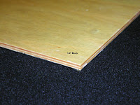
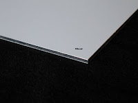
I bought and imported 2 ready-made boards from the States (New Traditions Panels), shown below. The first is baltic birch, sealed on the back with a triple coat of Polyurethane to keep the moisture out and minimize warping. The second is Dibond, a sturdy archival aluminum composite material made of two lightweight sheets with a thermal plastic core. Conservators recommend this panel because it's not supposed to warp.
The second obstacle was getting the canopy installed above the objects to create the shadows I want. Once that was done, I was able to finish the cartoon. Although I could have drawn directly on the panel with paint, I wasn't entirely certain how I would end up positioning the drawing. And so a paper cartoon gave me a chance to make changes without consequences. In the end, I made the drawing vertical and chose new dimensions: 12" wide by 16" tall.
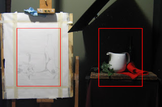
In the photo below, the red squares represent the "Frame". After I snapped the picture, I noticed that tape holding up the red cloth behind the tea pot had fallen off, so the cloth is flatter than it should be...
As an experiment, I tried a different approach to transferring the cartoon to the panel. I first coated the paper with raw umber. The oil in the paint was soon absorbed, leaving only the pigment. I then positioned the cartoon over the panel and retraced the drawing with a knitting needle. The end result is below. It's cleaner than if I had used charcoal (the usual approach).

I bought and imported 2 ready-made boards from the States (New Traditions Panels), shown below. The first is baltic birch, sealed on the back with a triple coat of Polyurethane to keep the moisture out and minimize warping. The second is Dibond, a sturdy archival aluminum composite material made of two lightweight sheets with a thermal plastic core. Conservators recommend this panel because it's not supposed to warp.


The second obstacle was getting the canopy installed above the objects to create the shadows I want. Once that was done, I was able to finish the cartoon. Although I could have drawn directly on the panel with paint, I wasn't entirely certain how I would end up positioning the drawing. And so a paper cartoon gave me a chance to make changes without consequences. In the end, I made the drawing vertical and chose new dimensions: 12" wide by 16" tall.
In the photo below, the red squares represent the "Frame". After I snapped the picture, I noticed that tape holding up the red cloth behind the tea pot had fallen off, so the cloth is flatter than it should be...

As an experiment, I tried a different approach to transferring the cartoon to the panel. I first coated the paper with raw umber. The oil in the paint was soon absorbed, leaving only the pigment. I then positioned the cartoon over the panel and retraced the drawing with a knitting needle. The end result is below. It's cleaner than if I had used charcoal (the usual approach).

Varnishing Demo
November 23rd: I finally witnessed a demonstration of varnishing, given by Juan Martinez at the school.
The painting had been left to dry for over a year, although only 6 months is needed. Any earlier than that and there's a risk that the varnish will bond with the uppermost paint layers. And the lowest layers may not have settled yet.
Juan washed his painting gently with a damp cloth on a flat surface. Then he opened up a box of Gamblin's Gambar varnish and mixed the 2 components -- resin chemicals dissolved with solvent. GAMBLIN's is the best brand becase it does not yellow over time and remains easy to remove with mild solvents for cleaning in the future (so that the paint layers won't be harmed). Adding it as the top layer of a painting saturates the colors and intensifies the transparency of glazes.
Wearing rubber gloves, Juan mixed only what he needed and poured it into a flat pan. The varnish can't be stored for long once mixed. If it's kept longer than 6 weeks, the varnish loses its UV protection and other qualities.
Re: application.... Instead of a brush, he picked up a sponge edger (for house painting), dipped it in a pan of varnish, wiped off the excess, and then applied a single thin coat to the entire painting.

It looks like a coat of water. But the mineral spirits soon dissolve, leaving a glossy finish. After drying for 24 hours, the painting can be given a second coat to make it glossier. Only 2 layers are necessary.
I found an online demo from Gamblin here.
The painting had been left to dry for over a year, although only 6 months is needed. Any earlier than that and there's a risk that the varnish will bond with the uppermost paint layers. And the lowest layers may not have settled yet.
Juan washed his painting gently with a damp cloth on a flat surface. Then he opened up a box of Gamblin's Gambar varnish and mixed the 2 components -- resin chemicals dissolved with solvent. GAMBLIN's is the best brand becase it does not yellow over time and remains easy to remove with mild solvents for cleaning in the future (so that the paint layers won't be harmed). Adding it as the top layer of a painting saturates the colors and intensifies the transparency of glazes.
Wearing rubber gloves, Juan mixed only what he needed and poured it into a flat pan. The varnish can't be stored for long once mixed. If it's kept longer than 6 weeks, the varnish loses its UV protection and other qualities.
Re: application.... Instead of a brush, he picked up a sponge edger (for house painting), dipped it in a pan of varnish, wiped off the excess, and then applied a single thin coat to the entire painting.

It looks like a coat of water. But the mineral spirits soon dissolve, leaving a glossy finish. After drying for 24 hours, the painting can be given a second coat to make it glossier. Only 2 layers are necessary.
I found an online demo from Gamblin here.
Old Iris Painting, new thoughts on composition
In 1986, I made this watercolour of a blue iris called "Victoria Falls". I wish I'd known more about composition at the time.
Here are some first principles I could have applied then (source: Michael John Angel's Pictoral Composition article on www.artrenewal.org)
-- a figurative element (even a flower) looks better when placed slightly-off centre
-- all things equal, the eye will go to the centre, or to that area of greatest contrast closest to the centre
-- the eye has a tendency to rise: when two elements are placed one above the other, the eye will eventually rise to the upper one.
-- elements need to be arranged in a comprehensible order, with a dominant element and secondary/tertiary elements ancillary to it.
-- there needs to be unity and variety. Unity (sameness) gives character; Variety (contrast) gives vivacity and life.
-- an anomaly (like a stray branch or flower) can call out to the viewer for attention, but if it's not the main focus, then it needs to be balanced with more anomalies placed around the dominant element. When the repetitions of the anomaly balance the dominant element(s), counterpoint results.
-- pure symmetry becomes boring in a small painting. Elements can be arranged asymmetrically, but balance is important -- lack of equilibrium makes us uncomfortable.
-- Asymmetrical symmetry is the most interesting form of arrangement whereby, for example, you can have a dominant element sitting on the vertical centre line and flanked by the same number of elements on each side, only arranged differently for variation (think of each side of a maple leaf).

So what would I do differently now? Make the central flower larger. Shrink the lower flowers and make them different sizes, placed at different heights, and use the bud as the equilizer (the balancer on a see-saw).
Here are some first principles I could have applied then (source: Michael John Angel's Pictoral Composition article on www.artrenewal.org)
-- a figurative element (even a flower) looks better when placed slightly-off centre
-- all things equal, the eye will go to the centre, or to that area of greatest contrast closest to the centre
-- the eye has a tendency to rise: when two elements are placed one above the other, the eye will eventually rise to the upper one.
-- elements need to be arranged in a comprehensible order, with a dominant element and secondary/tertiary elements ancillary to it.
-- there needs to be unity and variety. Unity (sameness) gives character; Variety (contrast) gives vivacity and life.
-- an anomaly (like a stray branch or flower) can call out to the viewer for attention, but if it's not the main focus, then it needs to be balanced with more anomalies placed around the dominant element. When the repetitions of the anomaly balance the dominant element(s), counterpoint results.
-- pure symmetry becomes boring in a small painting. Elements can be arranged asymmetrically, but balance is important -- lack of equilibrium makes us uncomfortable.
-- Asymmetrical symmetry is the most interesting form of arrangement whereby, for example, you can have a dominant element sitting on the vertical centre line and flanked by the same number of elements on each side, only arranged differently for variation (think of each side of a maple leaf).

So what would I do differently now? Make the central flower larger. Shrink the lower flowers and make them different sizes, placed at different heights, and use the bud as the equilizer (the balancer on a see-saw).
Thursday, October 15, 2009
Still Life -- final arrangement, but without lighting
This hasn't been easy but I've settled on a design for the first still life.
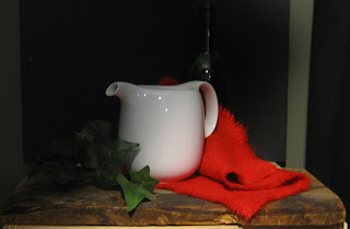
I was required to find 3 white, red, and green objects. In this exercise, there are only 2 objectives: to learn how to paint a shiny surface with colour reflections (in this case a white teapot) and to learn the indirect method of painting (the bright red napkin). The napkin is almost the colour of pure cadmium red and cadmium orange combined. Apparently, there's no way to create a full range of lights/darks in a cadmium red object without using a different technique. The normal technique would be to mix white and red together first to create a lighter value, but this only produces "pink". So the indirect technique is to paint something white FIRST and then apply glazes of cadmium red on top until the correct value is achieved...
The green is purely incidental. I was going to choose a set of plastic green grapes but was advised that they'd end up looking plastic. So then I experimented with a plastic leaves and settled on this branch of ivy. The green wine bottle in the background will be in shadow and I may pull it out entirely.
The board was suggested by an instructor as a means of adding texture that would contrast with the smooth, shiny surface of the pot. I've deliberately dangled the cloth and top leaves over the edge for another perspective.
Here's a view that from about 7 feet away. I still need to set up the canopy above the objects and angle the light differently. The light, while the correct distance, is directed straight on at the moment. I will be putting it on an angle...
I was required to find 3 white, red, and green objects. In this exercise, there are only 2 objectives: to learn how to paint a shiny surface with colour reflections (in this case a white teapot) and to learn the indirect method of painting (the bright red napkin). The napkin is almost the colour of pure cadmium red and cadmium orange combined. Apparently, there's no way to create a full range of lights/darks in a cadmium red object without using a different technique. The normal technique would be to mix white and red together first to create a lighter value, but this only produces "pink". So the indirect technique is to paint something white FIRST and then apply glazes of cadmium red on top until the correct value is achieved...
The green is purely incidental. I was going to choose a set of plastic green grapes but was advised that they'd end up looking plastic. So then I experimented with a plastic leaves and settled on this branch of ivy. The green wine bottle in the background will be in shadow and I may pull it out entirely.
The board was suggested by an instructor as a means of adding texture that would contrast with the smooth, shiny surface of the pot. I've deliberately dangled the cloth and top leaves over the edge for another perspective.
Here's a view that from about 7 feet away. I still need to set up the canopy above the objects and angle the light differently. The light, while the correct distance, is directed straight on at the moment. I will be putting it on an angle...

Tuesday, October 13, 2009
head and shoulders
Latest update: On Thanksgiving weekend, I concentrated on modelling the head and shoulders, as well as the shirt collar. The left eye is placed marginally too high on the figure (based on source photo) and I haven't given the head the same tilt it had, either. But those are minor details that I can choose to sort out later when I return to the head. The blue shirt also needs to be darkened considerably, right to left; and the lightest light of that shirt is currently too bright. The side of the shirt leaning against the curtain also needs a darker grey shadow, which is cast down and across from the window frame. But I will only be able to work these subtlies out once the entire background is in... That's the next task. The painting is now safely at home from the cottage...


Sunday, October 4, 2009
Blue shirt and shorts...
I spent some time this past Saturday trying to catch up on other areas... The previous weekend, I worked on the hands, arms and book. Here, I tried to bring the right side of the shirt and shorts up to par, by darkening them to match the value of the arm. Same with the background surrounding the head and torso... Head, and left side need to follow suite. Ideally, once everything in the figure is at the same stage, and it feels like it's one piece, with the light moving from the left to right into darkness, then I'll be read to tackle the background.
I've started to sketch in the window pane on the front left, making the frame narrower than it actually is... And I realized too that the back end of the cottage needs to be very soft and considerably darker than I've left it. The perspective on the back window pane makes it quite grey and hazy...


I've started to sketch in the window pane on the front left, making the frame narrower than it actually is... And I realized too that the back end of the cottage needs to be very soft and considerably darker than I've left it. The perspective on the back window pane makes it quite grey and hazy...


Subscribe to:
Posts (Atom)

 Posts
Posts

