Monday, July 1, 2013

Update on Family Portrait


Below are 3 images of my parents' portrait in progress over the month of June. The first one is the newest.

#1 The painting as of June 30th.  I laid in the hands as I see them in the reference photo, which unfortunately is overexposed in that area. But I've recently taken a set of reference photos for their hands and after I review them I'll have to see what final position makes sense. In the original, my mom is holding a handkerchief in her left hand while not seeming to grasp the branch itself, so the position of the thumb is a bit of a mystery. In the last session, I decided to concentrate on the blue coat, bringing up the chroma of the cobalt blue while trying to model the folds and curves on the right sleeve. In a later stage, once I've brought my dad's coat to the same level of completion, I'll bring the blue back down with a few glazes as needed....


#2 June 24. At this stage, I began laying down some blue over the base grey I laid down. In the reference photo, there are several blues at play, some on the purple side (cobalt blue) and some on the green side (cerulean blue). Eventually I decided to make cobalt blue the dominant blue in the coat and scarf, although I imagine I'll add some greenish/grey tints to reflect the surrounding shadows...


#3 June 4. Early work on my dad's portrait: The reference photo (shown in my previous post) places his face mostly in the shadows and his eyes are obscured by the reflection of his glasses. I've just positioned the features where I believe they should be. More refinement will be done later, especially balancing highlights with his skin tone.


Tuesday, May 28, 2013

New Project: Portrait of E. and R. Ray


I started a new project two weeks ago at the cottage: a portrait of my parents.
The reference photo below is an old digital photo from a visit to Haliburton on Thanksgiving in 2001.
In my first session, I did a quick dry brush drawing based on a cropped version of the photo. I wanted to focus more on them as subjects and include less of the background woods. But I felt that my placement of my Dad was flawed: with the left elbow disappearing into the right edge of the canvas, it made his left arm look like a stump! So I moved the figure to the left several inches. I lost a good drawing of his facial features, but I'll recover them later... The background woods will be lightened much later and I've decided not to include the tree trunk; I want to include some open space instead with the suggestion of younger trees and

For this painting, I'm trying a new gadget that allows me to connect an iPad to a tripod -- very handy!

Current state: 

Original layout: 

Reference Photo: 


Finishing Touches for Still Life #3


I'm in the final stage of this painting now. The pine cones and basket were completed in April.
For the last couple of sessions, I've been concentrating entirely on the red cloth, trying to recreate the criss-cross pattern in the cloth. At first, I was tempted to recreate all the black lines as they flow into the darkness. And then I realized that the lines become increasingly soft and lighter the farther back they go. Painting them this way has given the cloth a softness that contrasts nicely with the crisp outline of the apple. The attention stays on the apple, where I want it to be.  The real apple (substitute #3) was removed by students in late April when the smell became too much to be. I don't blame them. :)

For the final few sessions, I'm going to continue softening edges where they need to be softened, and also repaint the background one more time.


Monday, March 25, 2013

Pumpkin Amiss: the March 25th update on Still Life #3

The great pumpkin in my still life set up is history. Caput. It began to cave in on itself from the top so it had to go. May it rest in peace, along with Apple substitute #3. Unfortunately, now is not the season of pumpkins so it's been replaced with a brick to keep the basket up right (as you'll see from the second photo below). The interior of the basket no longer reflects the deep orange so when I was painting the interior weaving with a brown/pale yellow mixture, I added some orange as well.

Post-pumpkin, not everything is in the same place as it once was. The pine cones have fallen off the ledge more than once. The basket itself is not on precisely the same angle it was: I now see less on the left side than I used to. I'm also getting confused about the shape at the top of the basket, so I'm planning to correct that tonight by angling it in more sharply as it reaches the top of the panel and make it disappear into the darkness. For the weaving itself, I'm just trying to capture a sense of what it would be if it were my main focus, and then I'll blur the details so they don't take away from the painting's centre.


John W. Portrait nearing completion

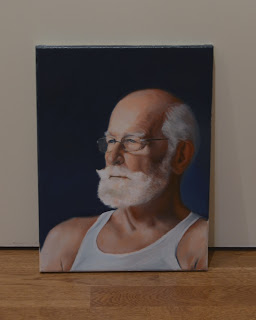
I took another pass at this portrait two Sundays ago, brightening up the blues in the lower background and repainting the areas around the eyes, cheeks, and forehead. On my to do list to finish up: getting the colour right in the nose and ear; cleaning up the edges of the T-Shirt, strengthening the frames of the glasses, and softening edges in various places.


Sunday, March 3, 2013

March 1 update on Still Life #3


Things are beginning to smell and a fine web of mould now coats the pumpkin... so I don't know how much longer I'll be able to keep the pumpkin in place. Yet its bright orange is such an influencer on the colour of the objects around it.

I've finished painting the first pine cone, the one sitting in the basket. I'm pleased with the colours I came up with but my drawing was not as good as it should have been. It's sitting a little "pinched" in shape.  Yet, I'm abandoning the accuracy of shapes. The pumpkin itself has shrunk about 10% in the last three months, so it's height/width are no longer serving as good guides for measuring the placement of anything else.

Only the basket has been a constant. I'm now beginning to add more detail in the weaving.

Closeup:


Full view:


John W. Portrait


Here's a portrait in progress of my friend, John Willard, quiltmaker, in Burlington. John posed patiently for me on his back porch in June of last year while I tried (and failed) both plein air and painting live from a model at the same time.

I've included a series of images which end with the photo I decided to use as a reference. There's still much to be done, including adjustments to the mouth, ears, nose, etc...

March 3 update... Here I'm trying out some darker colours but miss the brighter, lighter blues I once had  in the background. Yet, the colour from the photo is being badly influenced by my red studio walls. The proof: immediately below is the painting taken again at the other end of my home studio.


March 1 update with a different pallette that includes Venetian Red.


Early stage with an attempt to warm up the figure, July 22, 2012


Dry brush drawing, early July 2012 


The original reference photo, June 2012


Sunday, February 10, 2013

Update on the Perishable Still Life


Since my last blog post a month ago, I've taken the perishables (apple, pumpkin, and gourd) as far as I want to. I've been working on the wooden basket, correcting the curvature of the handle and trying to get the colours right, inside and out.  The inside of the basket picks up the reflected oranges of the pumpkin and nearby red cloth. The outside handle picks up the red cloth as it approaches the apple. But  I noticed yesterday how the curving handle also mimics the pattern of light on skin tones.  Moving from bottom right to top left, the handle follows a 4 colour pattern of warm darks, cool (greyish) half tones, warm local colour, and a cool highlight, before hitting a grey cast shadow and then returning to a warm shadow again. When I first painted this handle yesterday without any of the cool bands, the results were disappointing. When this area is dry, I'll add the pattern of the weaving...


Close up view:


The full setup:


Saturday, January 12, 2013

Apple Work


It's a new year and time to push forward on this still life to completion.
After Xmas break, I was surprised to find the pumpkin I bought in late September still intact with little change to its colour. The two spares I bought at the same time and stored in the fridge at home did not last as long. Perhaps the dry air in the school agrees with this pumpkin...

The original apple did not make it to 2013 and I was forced to replace it. On Monday, I auditioned nine candidates and finally settled on one that is not the same shape as the original but offers similar colouring under the school lights. Plus it has some interesting streaks and blemishes that help to emphasize the apple's curviness. There's also a stem, which the original lacked.

In the last few sessions, I've worked on the red cloth, the background, and most importantly the apple itself.

The close up: 
I nearly finished the apple today. In the next session, I'll paint in some of the blemishes and streaks to add character, and then it will be done.


The full view: 
The new apple is in place.